Telehealth
Talk to your doctor virtually
See your doctor virtually through video
As the COVID-19 pandemic accelerated the need for virtual healthcare, Sharp faced an immediate challenge: developing an intuitive telehealth interface that would help users confidently connect with doctors via video. The goal was to create an accessible, user-friendly experience that would guide users through virtual care while addressing their concerns and uncertainties
How might we streamline the PBM interface to reduce complexity, minimize errors, and improve user efficiency?
 Project Role
 Team Structure
 Tools
Tools
User Research and Insights
Understanding User NeedsThrough initial user interviews, we discovered that while users were open to virtual doctor visits, they had many questions and concerns:
- How does virtual urgent care work?
- What conditions can be treated virtually?
- How long are the visits?
- How much does it cost?
- How do I connect to a doctor?
These insights guided our design decisions, ensuring we provided clear, concise answers upfront.
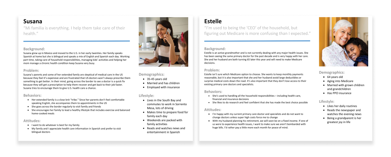
Primary Personas
Our research focused on two core personas:
- Susana (35-45 years old): A married mother managing her family's healthcare.
- Estelle (64 years old): A senior transitioning into Medicare and needing clarity on virtual care.
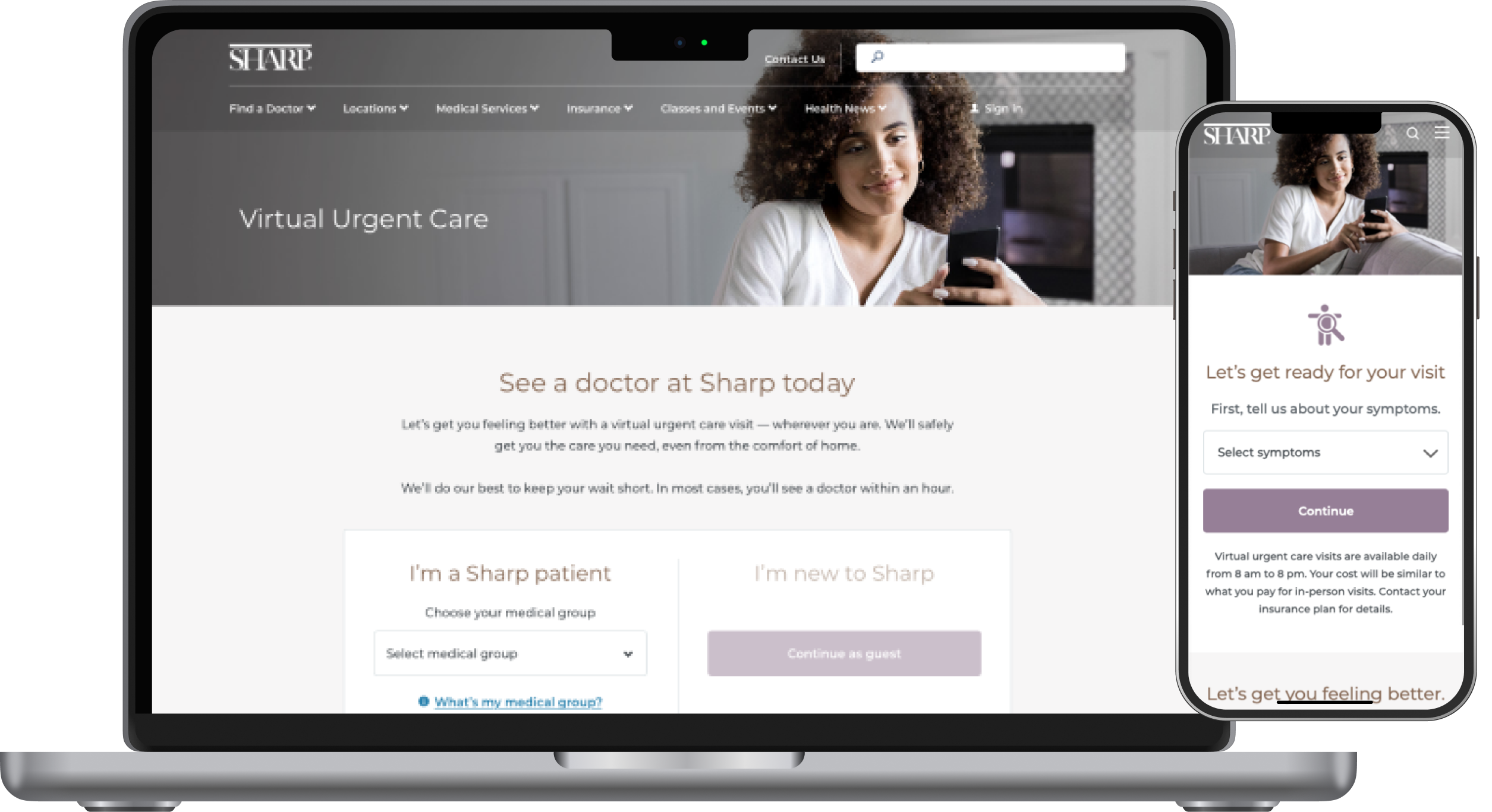
Designing the Telehealth Experience
Understanding the User Flow
We mapped user journeys to identify pain points and optimize touchpoints across multiple entry points:
- The landing page
- Doctor search results
- Location pages
Sharp’s Get Care campaign emphasized making healthcare easily accessible, ensuring users could navigate the system effortlessly.
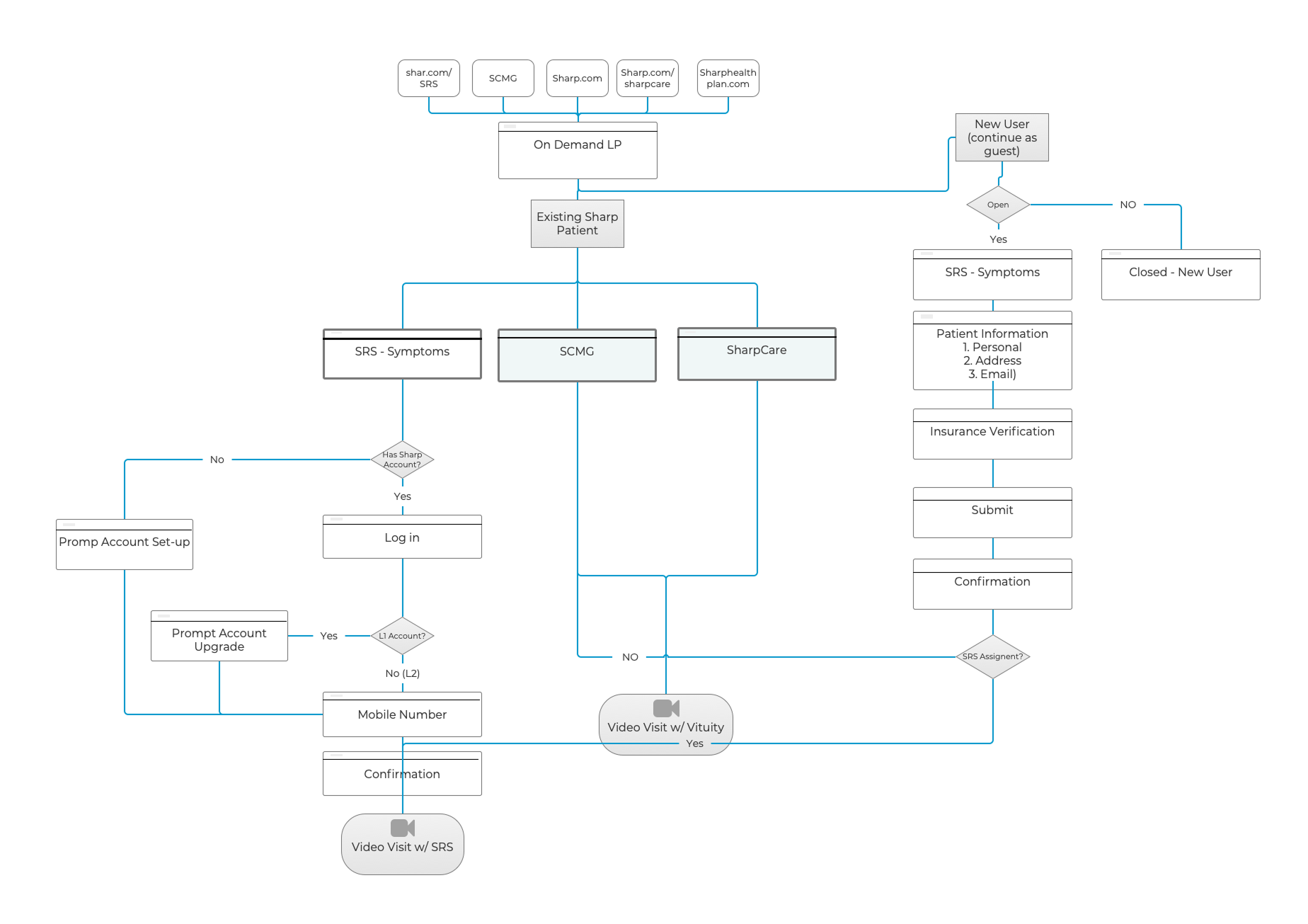
Journey Mapping & Key Challenges
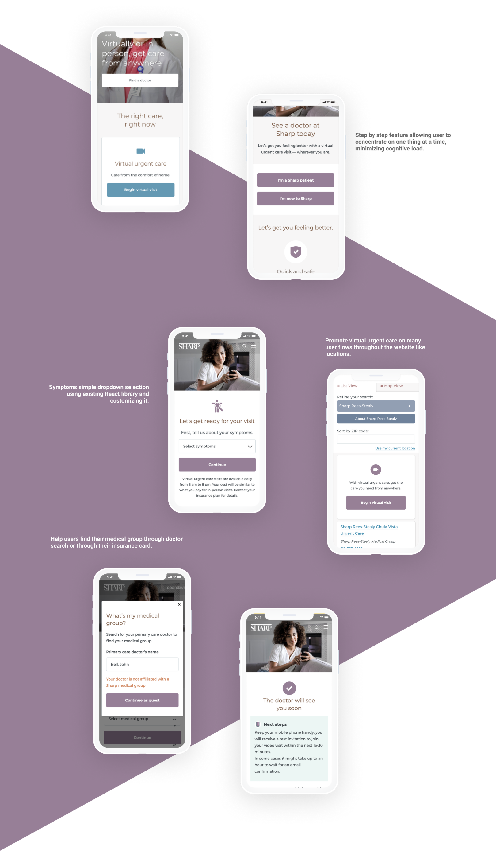
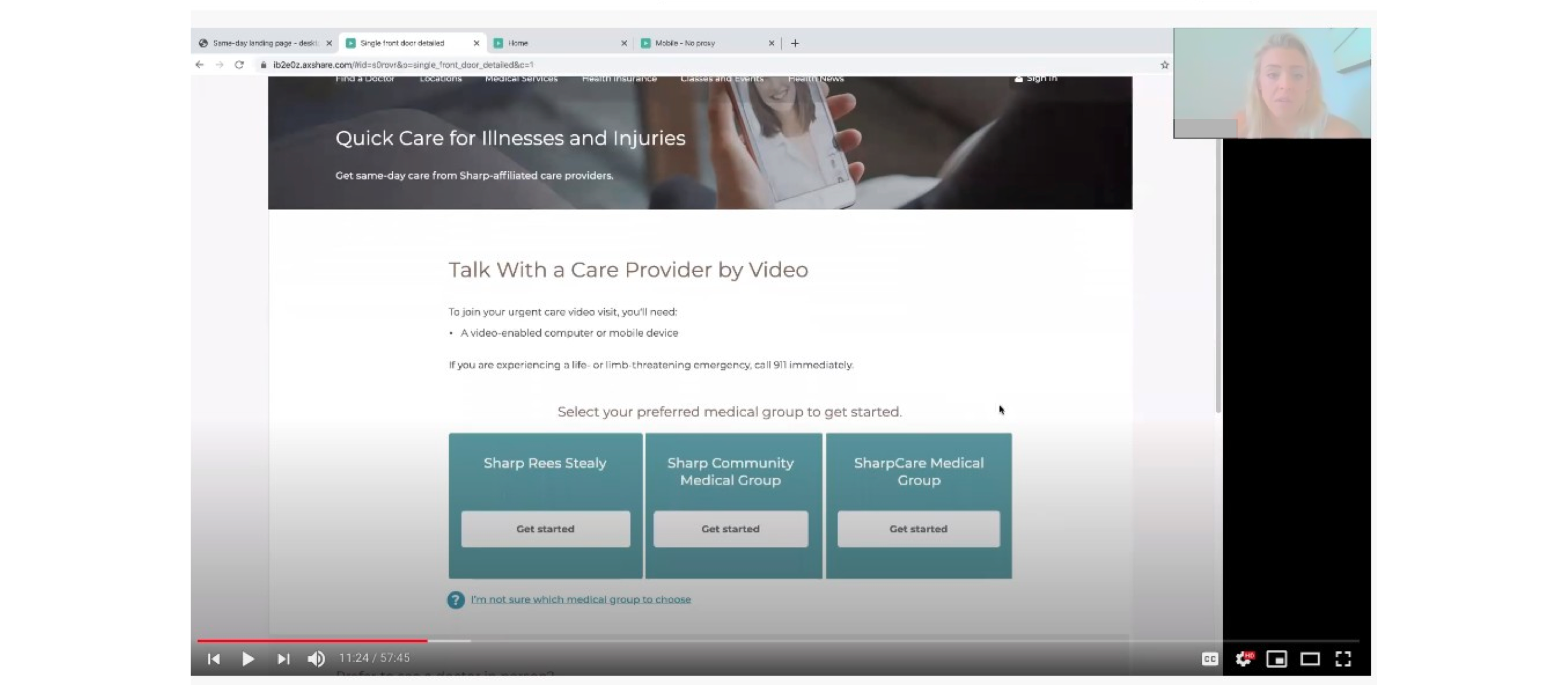
Journey mapping revealed that most users did not know their medical group, which was a significant barrier. Since each medical group used a different telehealth vendor, we had to develop a way to direct users correctly without confusion.
Key Problem: How do we help users identify their medical group quickly and intuitively?
Design Iteration & Solution Development
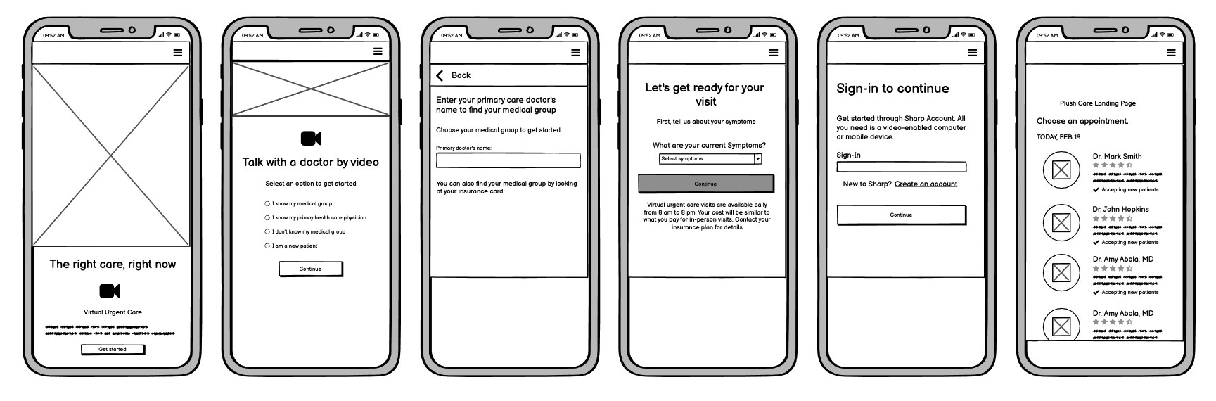
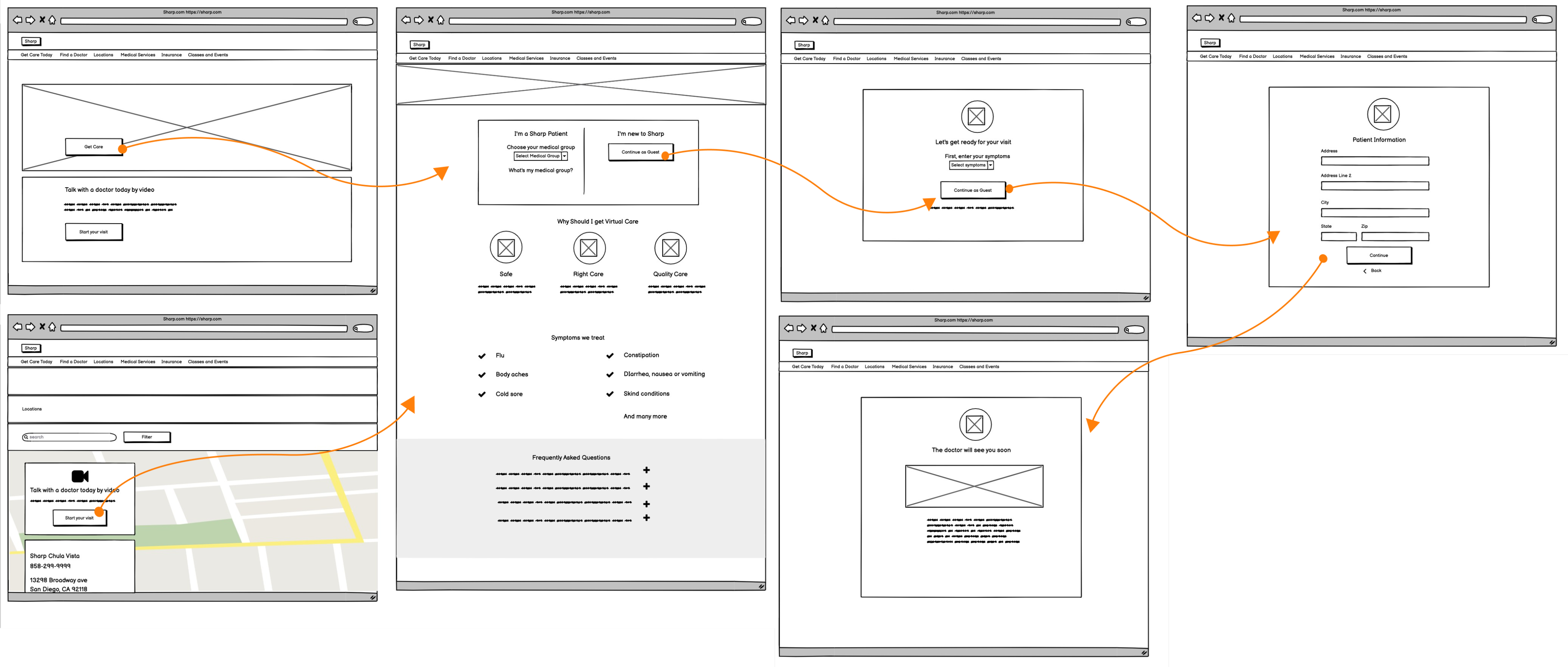
Phase 1: MVP Wireframes
The first iteration focused on launching quickly with minimal development effort. However, due to an outdated CMS, content was text-heavy, and users struggled with navigation. We identified the need for a more structured and engaging design.
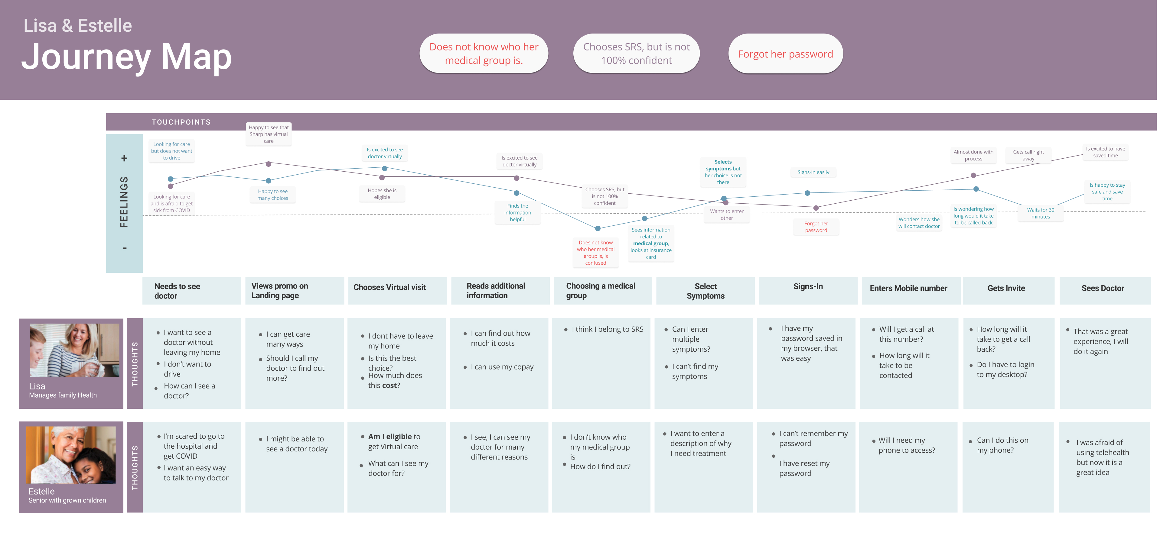
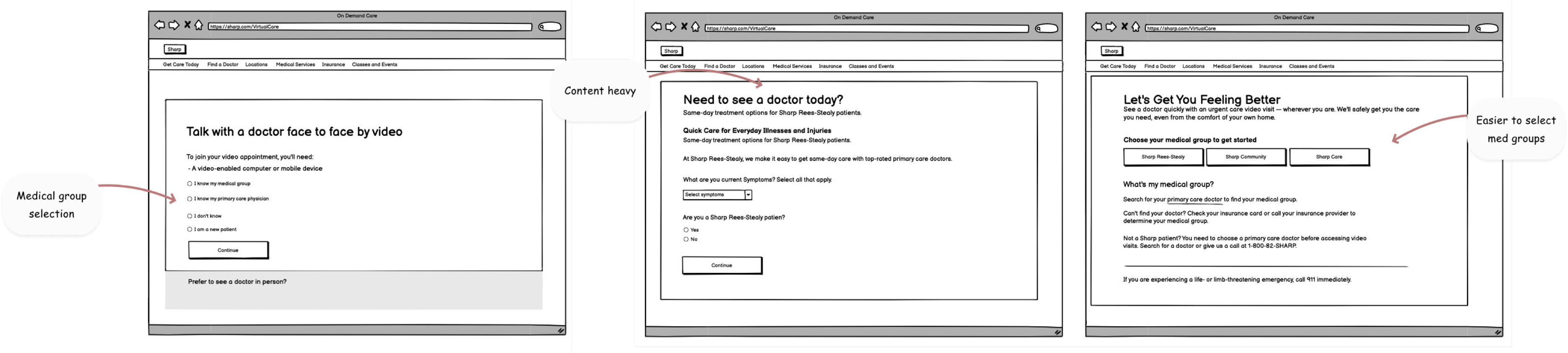
Phase 2: User Testing & Refinement
Initial user testing confirmed our concerns:
- Users struggled to select their medical group.
- Many were unsure if virtual visits were covered by their insurance.
- Users wanted quick, scannable information rather than long paragraphs.
Based on these findings, we refined the design to be more user-friendly:
- Progressive Disclosure: Information was revealed step-by-step to avoid overwhelming users.
- Guided Decision-Making: Users selected whether they were an existing or new patient, then were guided through a simplified flow.
- Content Simplification: Long paragraphs were replaced with bullet points, FAQs, and visual snippets.
- Medical Group Identification: We redesigned the flow to make it easier for users to identify their medical group or proceed without knowing it.
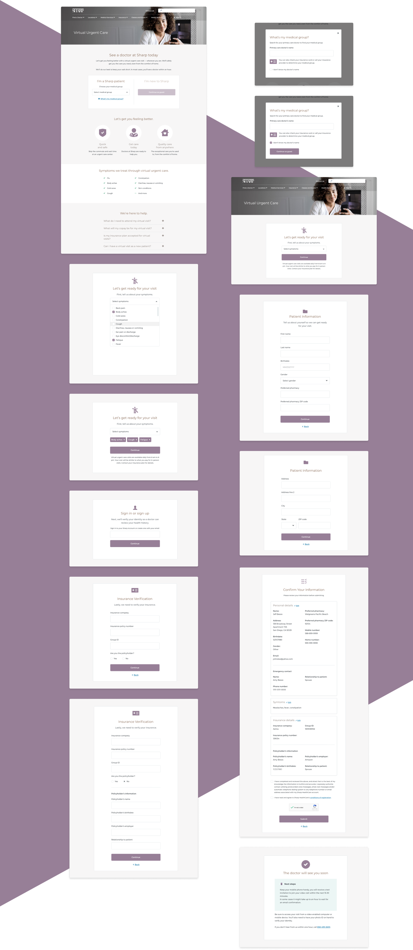
Final Design and Implementation
User Scenario: Becky, a Working Mom
Our persona, Becky, represented a busy mother multitasking while caring for her child. She needed an intuitive interface that required minimal effort.
Design Approach
- A mobile-optimized interface that allowed her to scan key information quickly.
- No need to read long explanations—answers were presented through FAQs, icons, and clear CTAs.
- A streamlined, frictionless path to scheduling a virtual visit.
User Testing - Phase 2
We tested the improved prototypes with real users, and feedback was overwhelmingly positive:
“This is amazing!”
“I love this!”
“This is so easy!”
These reactions validated our design choices and ensured we were ready for development.
Conclusion
By continuously refining the telehealth experience, we transformed Sharp’s virtual doctor interface from a constrained MVP into a seamless, intuitive, and user-centered solution. This project demonstrated the power of user research, iterative design, and agile adaptation, ensuring users could confidently access the care they needed—whenever and wherever they needed it.