1Empathize: Discovery & Research
Creative Discovery & User Research
Despite initial stakeholder resistance, I successfully demonstrated the value of research, leading to a
Creative Discovery Phase.
Through workshops and interviews, we identified key insights that reshaped our approach:
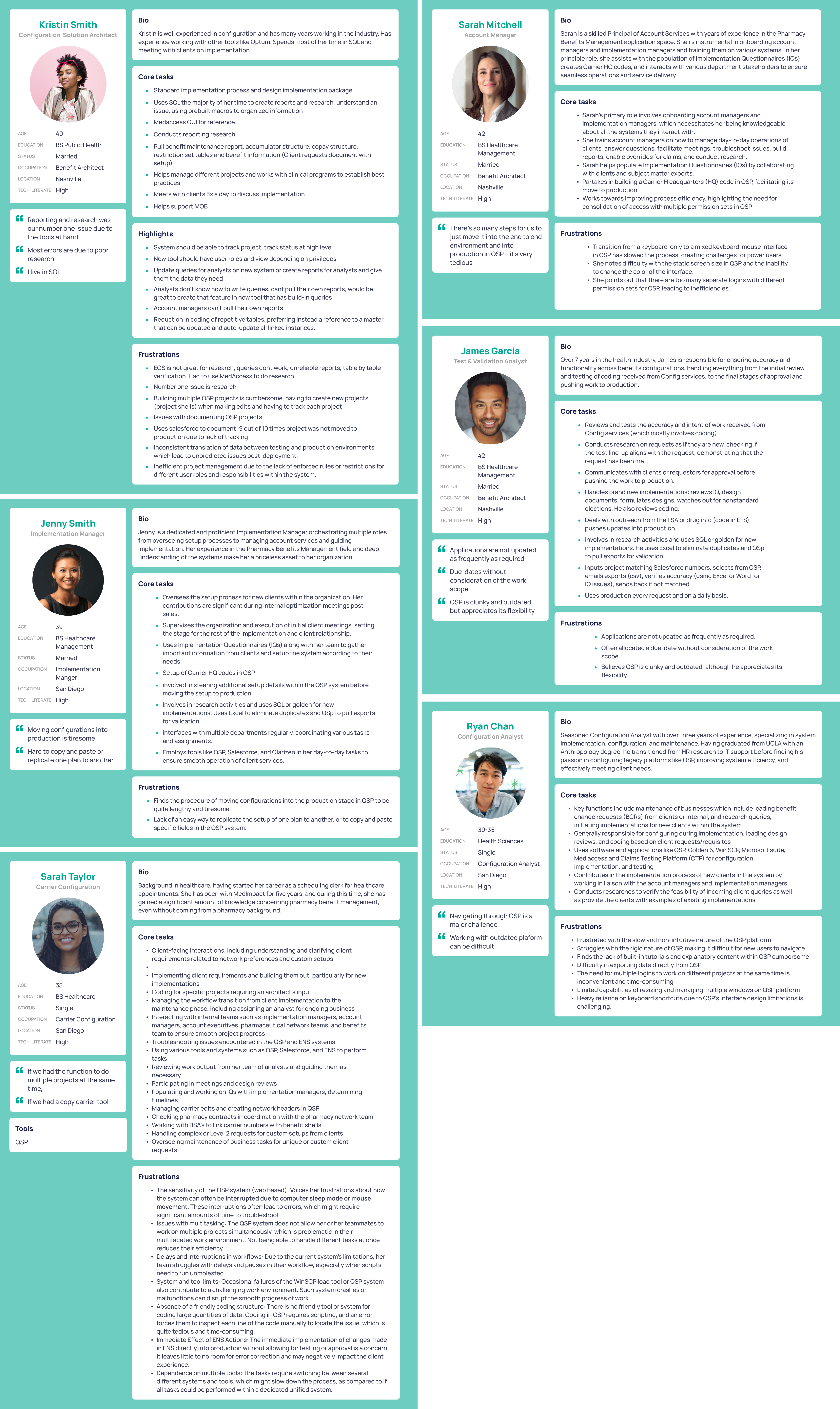
Persona Interviews
- Configuration Solution Architect (Main Persona)
- Account Manager
- Carrier Configuration
- Implementation Manager
- Test & Validation Analyst
- Configuration Analyst
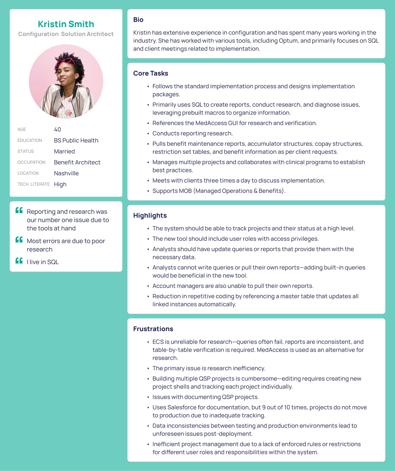
Primary Persona: Kristin
Among the multiple personas identified, we focused on Kristin, the primary persona, as she handled most of
the workload.
- Demographic: Experienced benefits manager at a large insurance company.
- Needs: Fast, accurate benefit configuration with minimal errors.
- Motivations: Reduce processing time, improve accuracy, and streamline workflows.
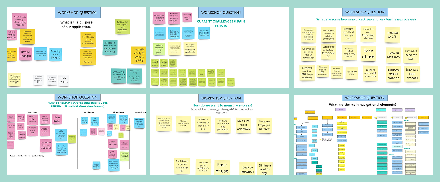
Discovery & Workshop Facilitation
I initiated and led a series of collaborative workshops designed to uncover both user and stakeholder
perspectives on the existing challenges within the Pharmacy Benefit Manager (PBM) system. My objectives were
to:
Understand User Pain Points: Gain insights into the difficulties users faced, particularly
regarding complex navigation, data overload, and error-prone processes.
Clarify Business Needs: Engage stakeholders to identify organizational goals and
requirements, ensuring alignment between user experience improvements and business objectives.
Foster Collaborative Understanding: Create a shared comprehension of the problem space
among cross-functional teams, facilitating a user-centered approach to solution development.
Through structured activities such as affinity mapping, journey mapping, and open discussions, I collected
qualitative data that informed the subsequent design phases. This approach ensured that the redesign was
grounded in real user experiences and aligned with business goals.
What We Learned
Through stakeholder workshops, we discovered that the primary business goal was to
reduce the time required to onboard new clients. A significant bottleneck was the phase
where benefit features, structures, and preferences were collected manually via documents. Our goal was to
gain a deep understanding of the user workflow, the onboarding process, and how benefit structures and plans
were being created—so we could identify opportunities to streamline and improve efficiency.
KPIs and measuring success
To drive meaningful design decisions, it was crucial to identify key performance indicators (KPIs) that
aligned both business objectives and user needs. We conducted a focused workshop with key stakeholders to
outline the KPIs that would measure the program’s success and directly inform design strategies.
- Task Completion Time: Reduction in time spent configuring benefits.
- Error Rate: Decrease in user-generated errors.
- User Satisfaction: Improved user feedback post-launch.
- Adoption Rate: Increased use of the new interface over the legacy system.
- Support Tickets: Reduction in user-reported issues.
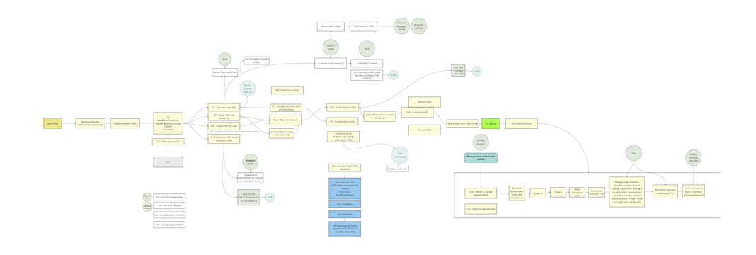
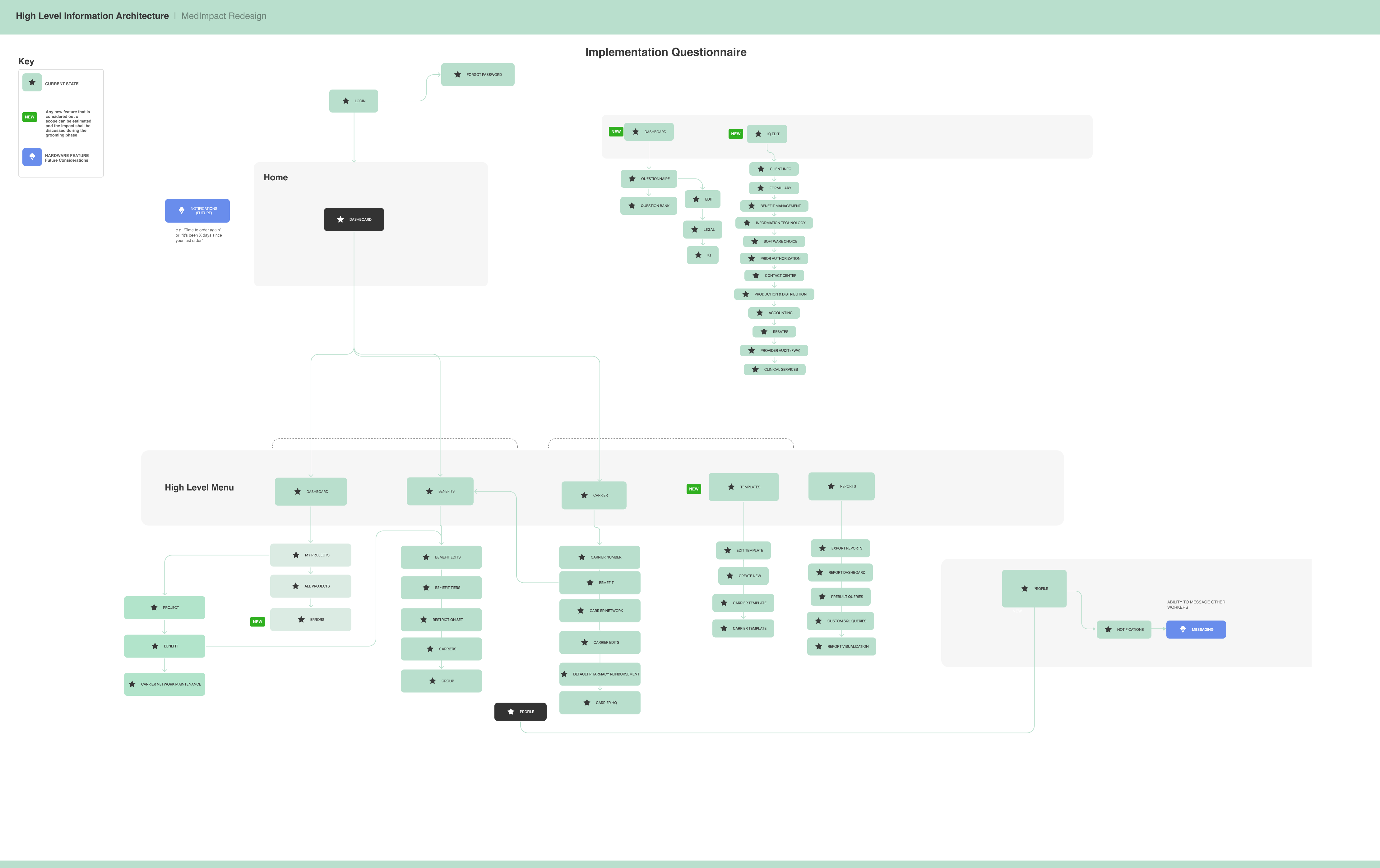
Information Architecture
We redesigned the Information Architecture (IA) to simplify navigation across benefit tiers, carriers, and
pricing models.
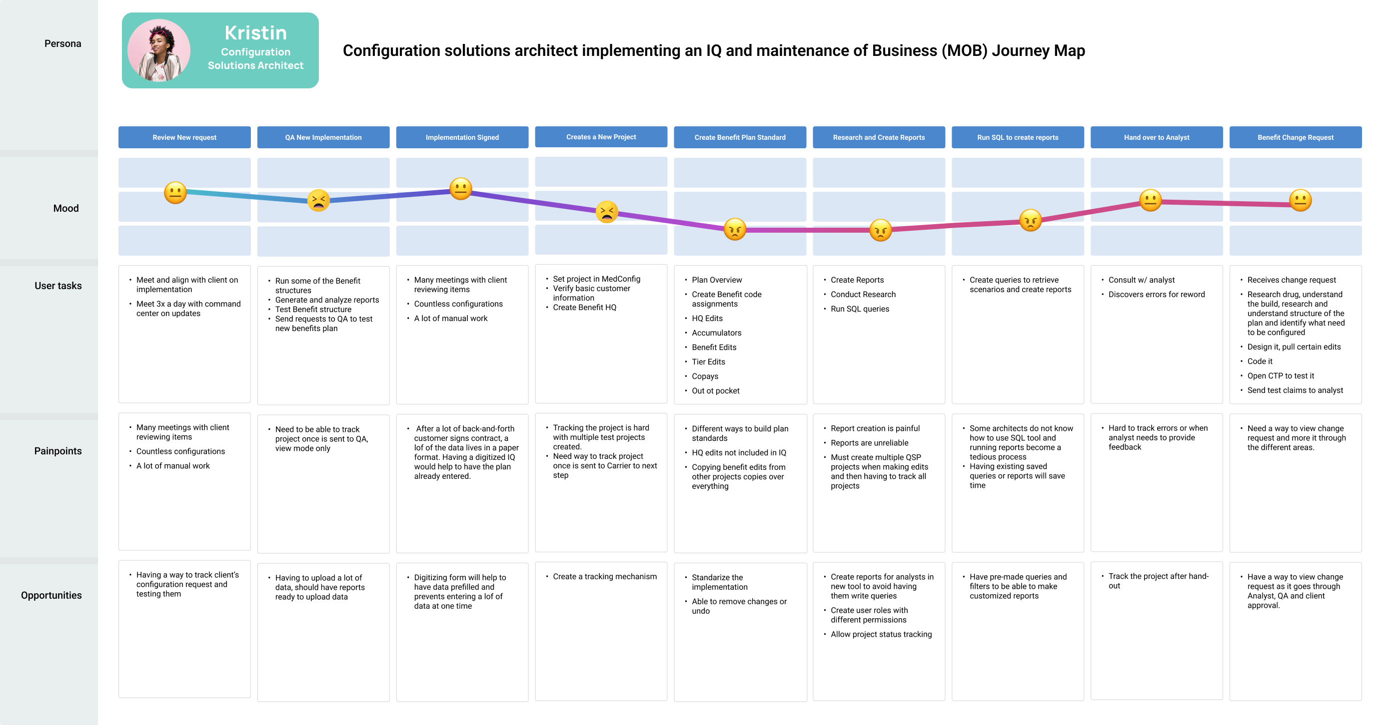
Journey Map
I developed a user journey map to visualize the end-to-end experience of key personas as they interact with
the system. This journey map highlighted user emotions, key touchpoints, and pain points at each stage of
the workflow—from initial login and benefit configuration to testing, approval, and claims validation. By
mapping out these interactions, we identified areas where users faced friction and optimized workflows to
create a more seamless and efficient experience.
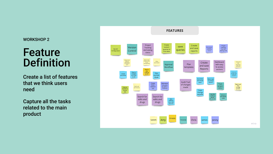
Phase 1 Digitizing the Questionnaire
2Definition
Mockup Phase: Digitizing the Implementation Questionnaire
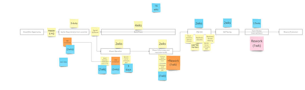
Discovery & Planning
We began by identifying the core challenge: the current paper or manual method of completing the
Implementation Questionnaire was time-consuming, inconsistent, and prone to error. From research with
stakeholders, it was clear we needed a more guided, digitized, and
user-friendly approach.
Initial Concepts & Flows
Before designing, we mapped out a user journey inspired by TurboTax. Our goals were to:
- Break content into logical sections (Client Info, Carrier Configuration, Formulary, etc.)
- Design a linear, low-friction flow with simple navigation
- Reduce cognitive load by focusing on one topic per screen
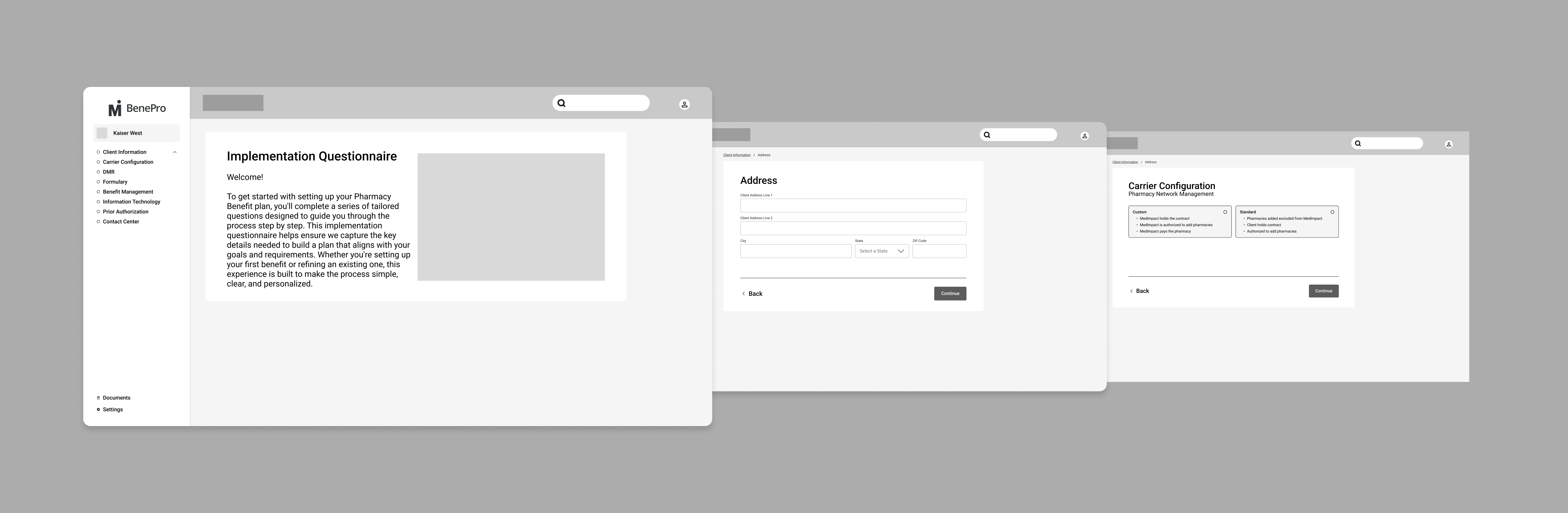
Low-Fidelity Wireframes
The mockups illustrated in the image capture the early layout of the experience:
- Landing Screen: Introduces users to the process and its purpose
- Sidebar Navigation: Displays high-level sections while guiding users step by step
- Form Screens: Collects structured inputs with clean, focused layouts
- Decision Screens: Presents choices (e.g., Custom vs Standard) with helpful context
Design Principles
- Progressive Disclosure: Show only what’s needed per step
- Guided Flow: Simplify decision-making through a structured path
- Reusable Components: Build modular question groups for scalability
- Future-State Ready: Structured for smart validations and future enhancements
Next Steps
- Test and validate with users (internal and external)
- Iterate based on usability feedback
- Add visual design and branding elements
- Create interactive prototypes for smoother handoff
- Collaborate closely with developers for implementation
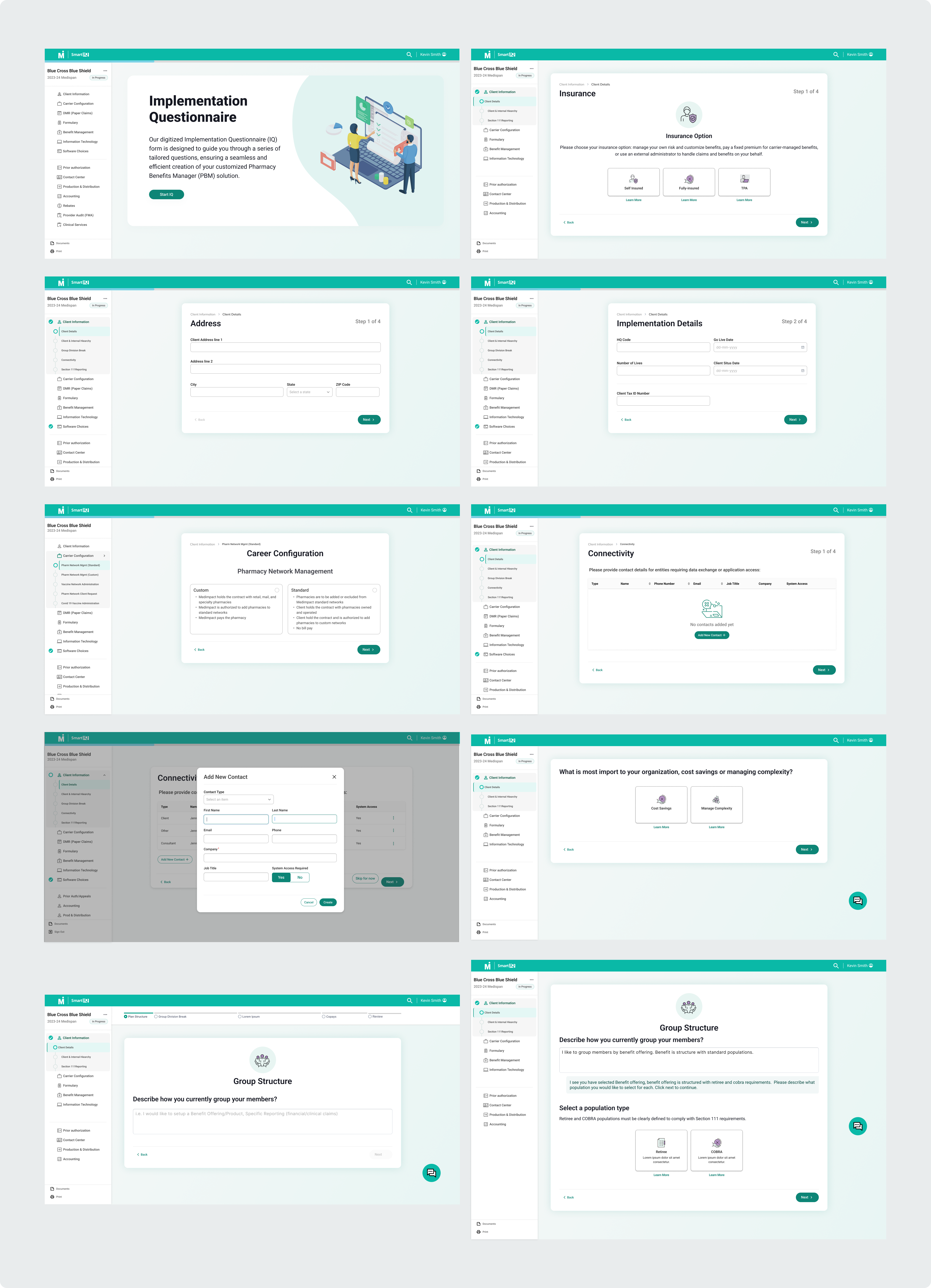
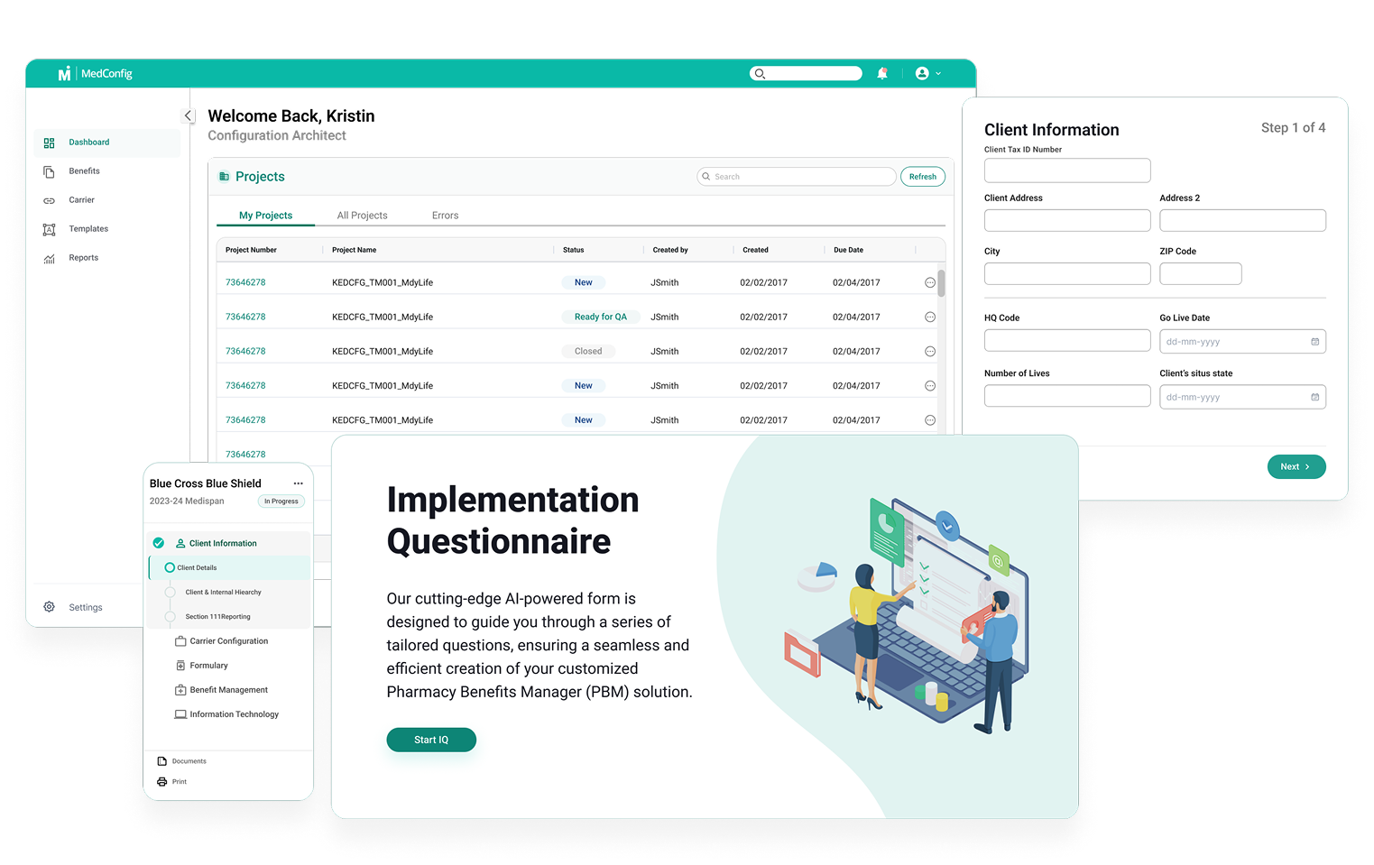
Final High-Fidelity Mockups & Results
After multiple rounds of wireframes, testing, and stakeholder feedback, we arrived at a set of high-fidelity
mockups that brought the Implementation Questionnaire (IQ) to life. These designs reflect a clear, modern UI
with a guided, TurboTax-inspired flow that simplifies the complex process of setting up a Pharmacy Benefit
Plan.
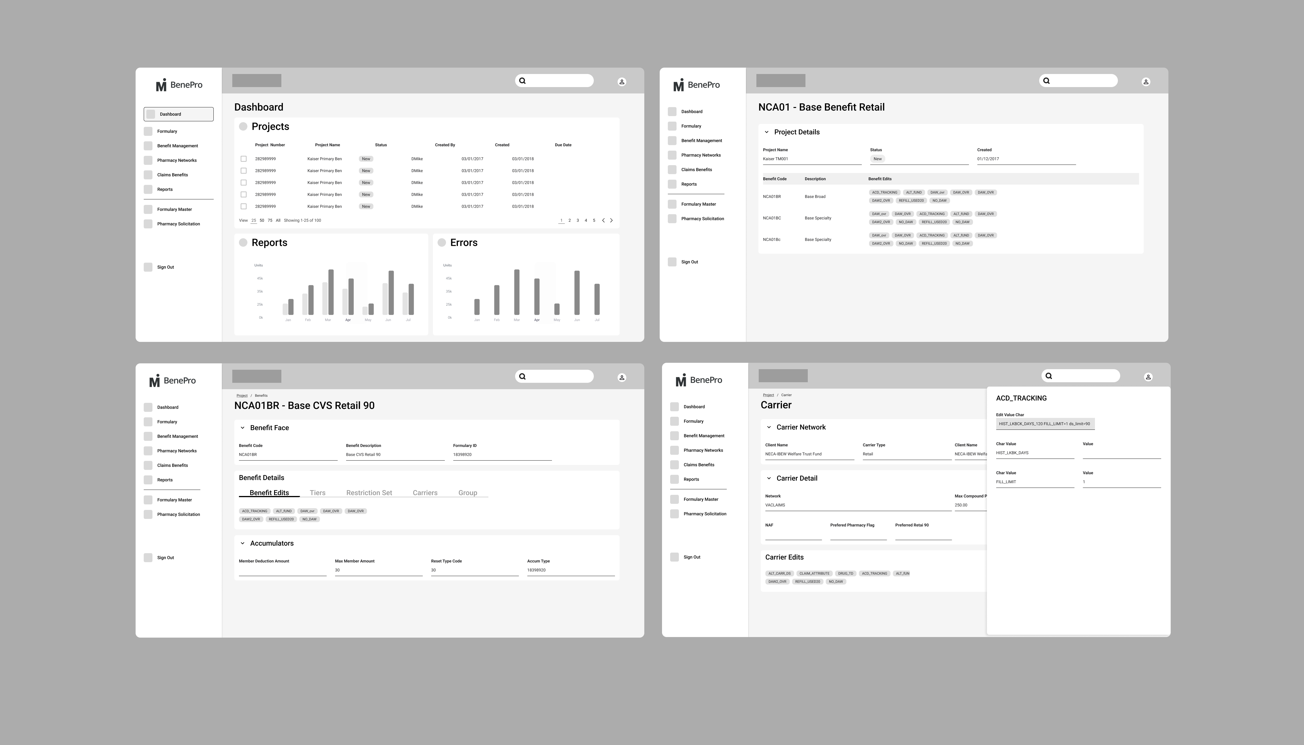
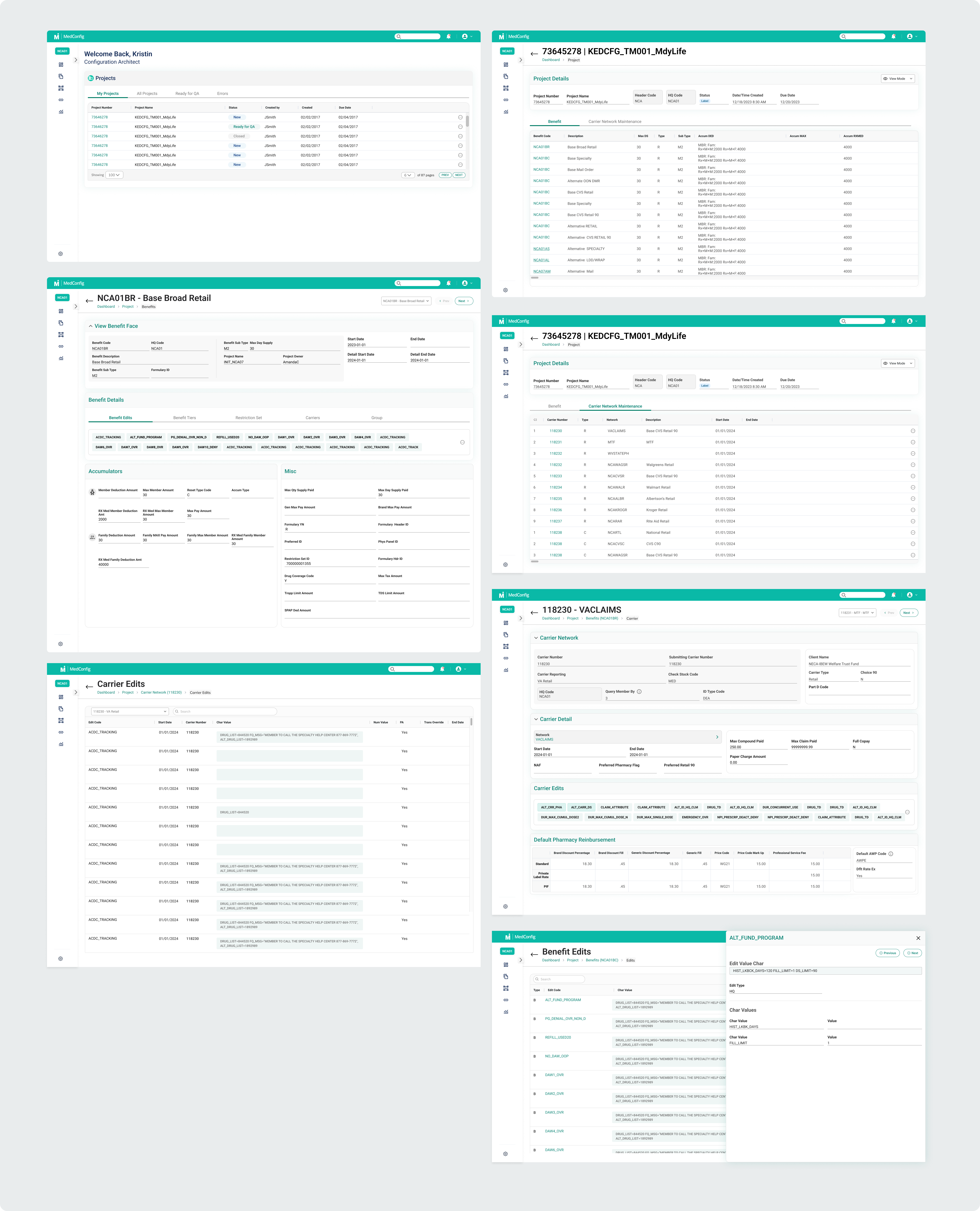
Phase 2 Creation of the Benefit Plan Interface
2Definition
After completing the digitization of the Implementation Questionnaire, we moved into Phase 2: designing the
Benefit Plan Interface. This part of the project focused on enabling users—primarily admins
and benefit specialists—to create, edit, and manage benefit plans through a centralized dashboard and
supporting screens.
The goal was to provide visibility and control over the structure of the benefit offerings, including
coverage tiers, cost-sharing rules, eligibility groups, and reporting options.
Wireframes & Iteration
We explored low-fidelity sketches and wireframes that emphasized clarity, modularity, and quick access to
key actions. Iterative testing helped us refine the layout and reduce cognitive load.
Key Takeaways
1. MVP Success with Measurable Impact
- 80% faster questionnaire completion time
- Improved data accuracy via smart defaults and validations
- 40% reduction in task time for benefit plan management
- Positive stakeholder feedback and higher user confidence
2. Design System Foundations
Modular, reusable components were created to support consistency across the two phases, establishing a
strong foundation for future scalability and maintainability.
3. Research-Driven Decisions
Despite initial resistance, user and stakeholder research became a critical part of the process—shaping
workflows, layout, and IA based on real user pain points and business goals.
4. TurboTax-Inspired Flow
A step-by-step guided flow reduced cognitive load and made a complex, high-stakes process feel approachable
and intuitive for users.
5. Collaboration Was Key
Cross-functional collaboration with engineering, QA, and product stakeholders ensured alignment from
research through final handoff—helping the MVP launch on time with minimal rework.
Future Opportunities
- Build out the remaining pages of the application
- Define user profiles and set up role-based permissions
- Develop the project tracking functionality
- Design and implement reusable report templates
 Project Role
 Team Structure
 Tools
Tools