Eyecare Network

Seamless Access for Patients, Powerful Tools for Optometrists

Portfolio Hero Image

Overview

I designed a user-friendly website for an Optometry Network, enabling their member clinics to offer patients an easy way to schedule appointments and manage their eye care needs online. The platform equips optometrists with tools to enhance patient engagement, streamline appointment scheduling, and provide access to prescriptions and appointment-related documents.

Design Goal

How might we design a streamlined, intuitive, and accessible platform that addresses these pain points and enhances the overall patient experience.

Project Role

Lead UX/UI Designer – Led the design process, oversaw junior designers, and contributed to prototyping, ideation, and creative discovery.

Team Structure

Junior UX/UI Designer, Business Analyst, Project Manager, Scrum Master, Front-end Lead, Back-end Lead, QA Lead, Client contact

Tools

Figma, Figjam, Miro, Photoshop

Creative Discovery

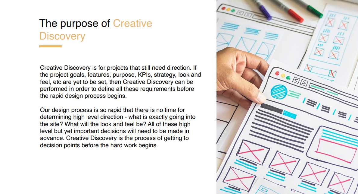
The Creative Discovery phase was a six-week process focused on gathering insights into the project and client needs while also educating the client on our process, terminology, and project requirements. Since direct user research was not conducted, we relied on industry best practices, competitor analysis, and heuristic evaluations to inform design decisions, ensuring an intuitive and patient-friendly experience.

Key Activities Conducted

  • Feature Set Workshops: Identifying and prioritizing essential features for the website.
  • Navigation Recommendations: Creating an information architecture and establishing key performance indicators (KPIs) for usability.
  • Competitor Analysis: Evaluating industry benchmarks to identify strengths, gaps, and best practices.
  • Design Style Exploration: Establishing a cohesive visual identity aligned with the client's brand and accessibility standards.
  • Hero Flow Prototyping: Developing a high-fidelity prototype showcasing the ideal user journey through the platform.
Creative Discovery

From Creative Discovery to Product Launch

Creative Discovery Process

Client & Stakeholder Workshops

To align on business goals, user needs, and technical constraints, we conducted workshops to gather insights. These sessions focused on defining key success metrics (e.g., appointment volume, patient retention), identifying essential features, and addressing pain points from both patient and clinic perspectives.

Activities:

  • Discussed overarching goals: improving patient engagement, streamline appointment scheduling, and enhance self-service capabilities.
  • Define success metrics (e.g., appointment volume, patient retention, portal logins).
  • Document pain points from both the patient and clinic perspectives.

Feature Definition Workshop

For feature definition, we conducted a workshop with the client to identify and define the key features of the website.

Feature Listing

Persona Discovery & Behavior Mapping

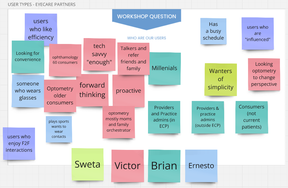
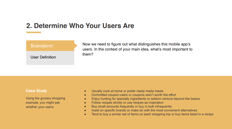
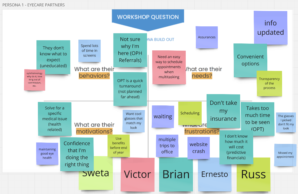
In this workshop, we collaborated with the client to define user personas by exploring their behaviors, needs, motivations, and frustrations. Through guided discussions and exercises, we identified key user characteristics and pain points, ensuring the product aligns with real user expectations and enhances their overall experience.
WHo are our Users
Persona Build
WHo are our users2

Primary Persona: Sarah

From our workshops, we created Sarah—a representation of our key user. Her needs, motivations, and frustrations shape our design decisions, ensuring a user-focused experience.

Primary Persona4

App Definition Statement Workshop

Goal: Align stakeholders on a clear, user-centered definition of the website's purpose and value.

Primary Persona

Definition Statement Outcome

Following our workshop with the client, we aligned on the statement:

"A convenient tool for active people who are managing their eye care needs."

This statement serves as our guiding vision, ensuring the solution meets user and business needs.
Wireframing & UX Process for the Eyecare Network Platform

Objective

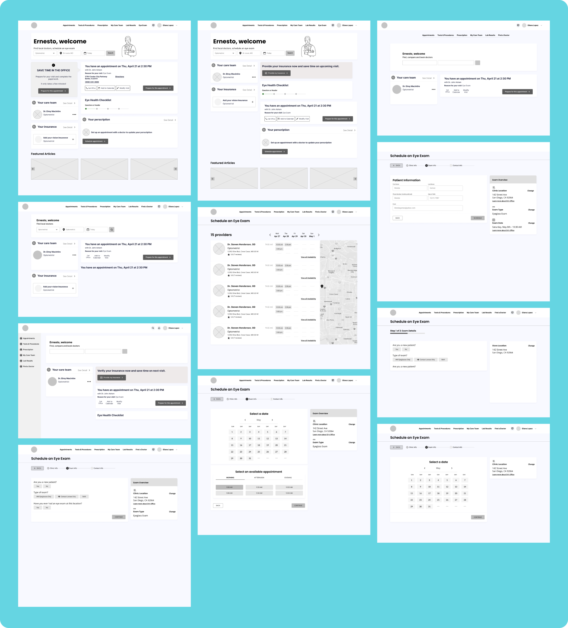
The wireframing phase focused on creating low-fidelity blueprints for key pages and user flows, refining them based on client feedback before moving to UI design.

Key Focus Areas

For the creative discovery phase, we focused solely on designing the "hero path"—the ideal route a user typically follows to complete their primary task.

1. Patient Dashboard

  • Designed to provide quick access to records, prescriptions, and billing.
  • Prioritized a clean layout with a clear hierarchy to help users locate important information easily.
  • Included prescription history, insurance details, and upcoming appointments for better patient engagement.

2. Appointment Scheduling

  • One of the primary features, designed for both desktop and mobile.
  • Focused on breaking down the process into smaller steps to reduce cognitive load and ensure a frictionless experience.
  • Integrated family management capabilities to allow users to schedule appointments for dependents.
  • Enabled users to upload insurance cards via mobile devices for added convenience.
  • Included confirmation notifications and reminders to reduce no-shows.

3. Find a Doctor Tool

  • Implemented advanced filtering options (location, specialization, insurance compatibility, availability) to help patients find the right optometrist quickly.
  • Designed with a map view for users who prefer geographic visualization of nearby clinics.
  • Gathered feedback on pain points such as appointment scheduling complexity and optimized steps to improve efficiency.

Additional Key Features

Digital Document Signature

  • Implemented e-signature functionality to allow patients to sign forms digitally, eliminating the need for printing.
  • This feature aimed to save time, streamline administrative processes, and ensure patients could complete paperwork before their appointment.

Billing & Payments

  • Integrated an online payment system for managing bills efficiently.
  • Designed to allow users to view outstanding balances, make secure payments, and track past transactions.

Design Decisions & Rationale

  • Step-by-step scheduling process – Reduced cognitive overload, making it easier for users to book appointments without confusion.
  • Mobile-first approach – Given that users may need to schedule appointments on the go, mobile usability was a top priority.
  • Minimalistic UI with clear CTAs – Ensured users could quickly find what they needed without unnecessary distractions.
  • Accessibility considerations – Used high-contrast elements and readable fonts to ensure inclusivity for users with visual impairments.

By implementing these features, the platform enhanced operational efficiency for optometrists while improving the overall patient experience.

Wireframes

Design Evolution & Iterations

Through multiple iterations, we refined the UI based on client feedback. Early stages focused on exploring different layouts, color schemes, and navigation structures. The final design prioritized clarity, accessibility, and a modern aesthetic that aligned with the brand's vision.

Note: During the creative discovery phase, we reviewed only the mobile screens and the "hero path"—the ideal user journey to accomplish the website's primary goal. Desktop designs were addressed in later phases.

Iteration 1

In Iteration 1, I explored various color schemes, button styles, and layout structures to establish a strong foundation for the design. The client provided feedback on elements they liked and areas that required refinement.

Iteration 1 Design

Iteration 2

For Iteration 2, I incorporated the feedback by adjusting typography, spacing, and overall visual hierarchy. This version also tested different login and dashboard layouts to ensure ease of navigation and accessibility.

Iteration 2 Design

Iteration 3

By Iteration 3, we had narrowed down the preferred look and feel. The client favored a clean, modern design with a professional yet inviting color palette. After final tweaks, such as refining CTA buttons and optimizing text legibility, we arrived at the final design that best met the client’s needs and expectations.

Iteration 3 Design

Objective: Build a Cohesive UI Kit

We followed the client’s existing brand colors and guidelines, using their teal as the foundation for digital branding.

Key Components:

Design Principles:

final Mobile Screens

Final Deliverables

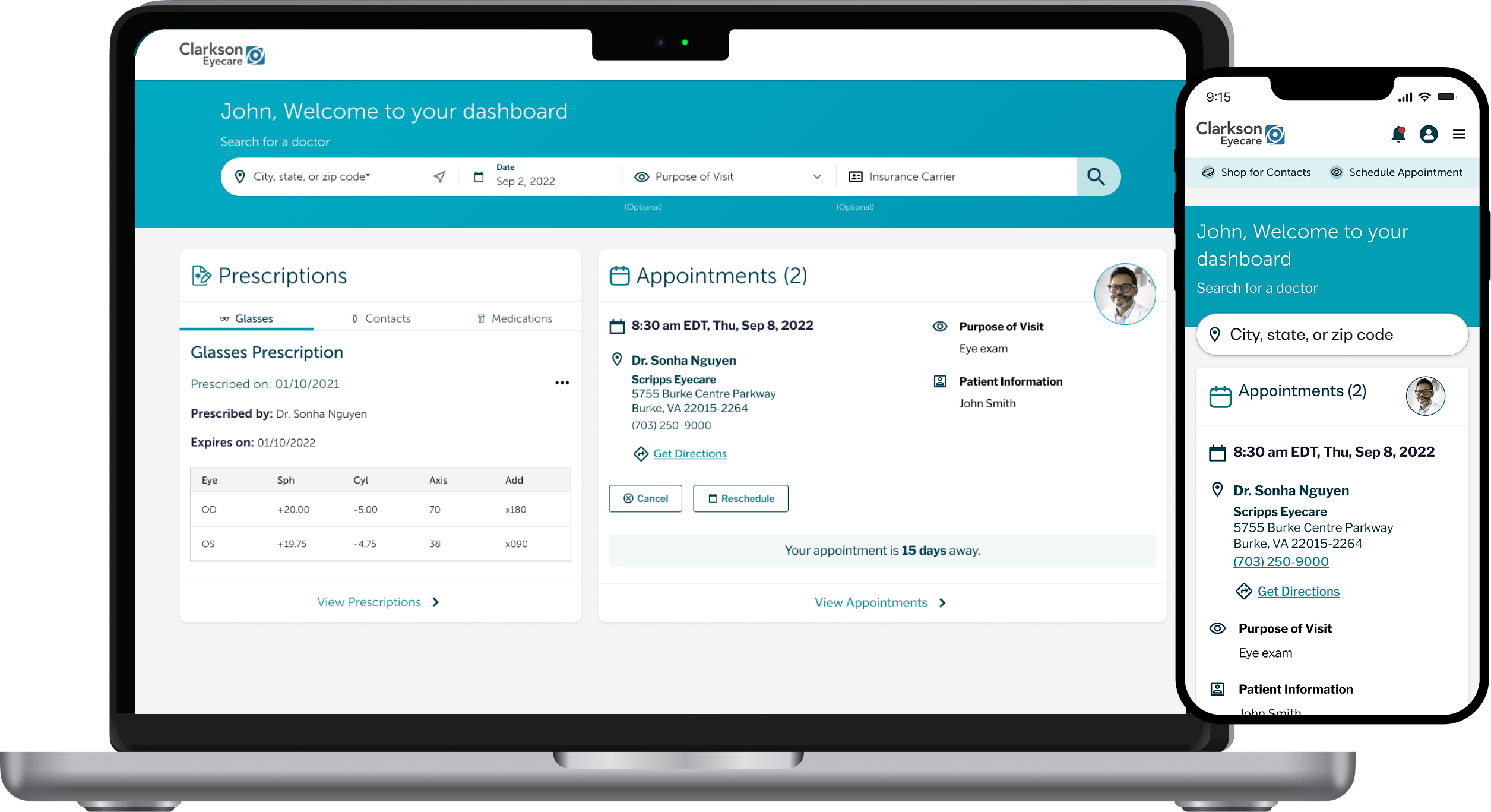
The final high-fidelity mockups present the polished design of the Eyecare Network website, workshops, and design iterations into a cohesive interface. They showcase finalized typography, color schemes, iconography, and interactive elements, ensuring brand consistency and accessibility.

Key user flows such as scheduling appointments, viewing prescription results, and finding a doctor—are fully visualized to highlight ease of use and efficient navigation. Responsive design ensures a seamless experience across desktop, tablet, and mobile devices.

Mockups Mobile screens
Mockups showing MedImpact screens