Empowered Decisions
Back Pain Management Platform Design
The Need
Back pain is one of the leading causes of disability worldwide, with millions seeking treatment. Many
individuals turn to surgery as a last resort, often due to the lack of accessible alternatives.
Empowered Decisions was created to bridge this gap—providing users with the tools, guidance, and
knowledge necessary to manage and alleviate back pain without surgery, ultimately improving their
quality of life.
American Specialty Health is a health and wellness company that provides wellness solutions to
businesses, aiming to keep employees healthy while reducing employers' expenses on costly healthcare,
particularly back-pain surgeries.
My Contributions
This project is one of my favorites because I was involved in every stage, from inception to launch. I
led workshops, collaborated on user research, engaged stakeholders, and designed both the aesthetics and
front-end components. This experience reinforced the critical role of research in a project's success.
Goal: "Design a digital platform offering expert-guided courses, personalized coaching, and
curated resources to help users manage back pain effectively—without surgery."
 Project Role
Responsible for UX/UI design, visual design, prototyping, and leading the creative discovery phase.
 Team Structure
Stakeholders: Wellness Consultants, Clinical Advisors, Product Owners.
Design & Development Team: 1 UX Architect, 1 UX/UI Designer, Product Owner, Scrum Master,
Business Administrator, QA & Developers.
 Tools
Tools
Sketch, InVision, Miro, Photoshop, Illustrator
Impact
The Empowered Decisions back pain management platform successfully launched, providing millions of
individuals suffering from back pain with accessible, non-surgical relief solutions. The app’s impact
and growth were reflected in the following key metrics:
40%
Increase in daily active users within the first 3 monhts
$250K+ Users
Engaged with the platform the first year
65%
User retention rate after 5 months of consistent use
4.6/5
Average user rating, indicating high satisfaction with guided exercises and pain management tools
1Empathize: Discovery & Research
Getting Started
Objectives:
- Understand who the users are.
- Identify user pain points, behaviors, and motivations.
- Understand the business need.
- Gain insights from medical professionals and wellness experts.
- Conduct workshops to identify needs.
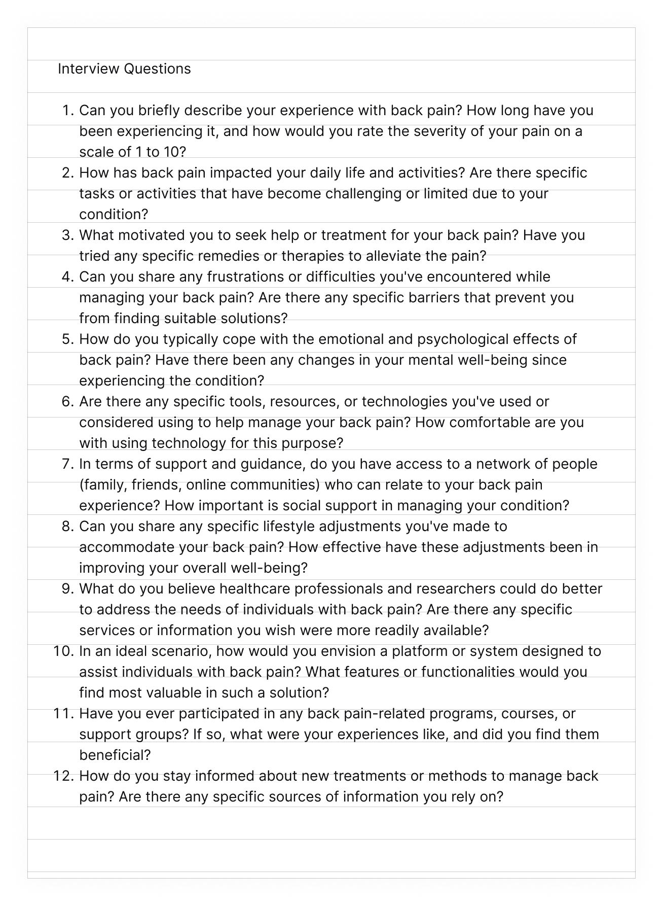
User Interviews
Interviewed seven participants to learn about their experience, goals, and pain points.
We wanted to learn about what people with back pain deal with, such as mobility issues, daily activities,
and work limitations.
How do people gather data to deal with back pain? Where do they go, what sources do they use?
We particularly wanted to understand their motivations—whether it was family, fun, or leisure.
Survey and Social media research
Quantitative Survey
Sent out surveys to about 90 Participants to ask about people’s experience with back pain and the level of
their pain.
Joined social media groups to learn about users' experiences and recruit participants.
Stakeholder Interviews:
Met with stakeholders from various wellness products to understand their needs and explore how a
back-pain-focused platform could align with their business goals. Discussions focused on key product
requirements, including essential features such as pain tracking, methods for measuring pain, and educational
content (determining reliable sources), along with necessary integrations with existing health tools.
Additionally, we explored user engagement strategies, such as personalized content, gamification, to improve
retention. Technical constraints, platform compatibility, and customer support needs were also key
considerations. By gathering these insights, I ensured that the design direction balanced business objectives,
user expectations, and operational feasibility.
Team Workshops
We conducted team workshops to define the website’s features, including content strategy, key functionalities,
and interface interactions. These sessions also helped us clarify project goals, prioritize features, and
establish a development timeline.
Key Findings
-
Users struggle to find trustworthy and consolidated information; they use various websites and online
sources, but nothing is in one place.
- Back pain significantly impacts mobility, productivity, and mental well-being.
- Users are open to using online resources, mobile apps, and wearable tracking tools.
- Users have previously tried therapy, exercises, and pain medication but lack ongoing guidance.
- Users are highly willing to follow health coach recommendations.
- A majority prefer chat-based communication over phone calls for coaching sessions.
-
Some older users felt motivated by having the freedom to play with their grandchildren without back-pain and
have the ability to stay active.
2Define & Plan
Defining the Problem: Understanding the Gaps in Back Pain Management
Objectives:
-
Develop personas representing different user segments (e.g., office workers, athletes, elderly
individuals).
- Create user journey maps to visualize user interactions and decision points.
- Establish key performance indicators (KPIs) to measure success.
- Define feature requirements.
- Define content strategy and the hierarchy of information for ease of navigation.
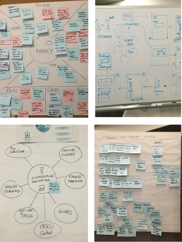
During collaborative brainstorming sessions with stakeholders, we worked together to generate initial design
solutions, addressing insights gathered on user needs. Our process begins with
empathy mapping to deeply understand our target personas' needs, preferences, and pain
points, serving as the foundation for our ideation.
Initially, we attempted to include too many features, which risked overwhelming the project scope.
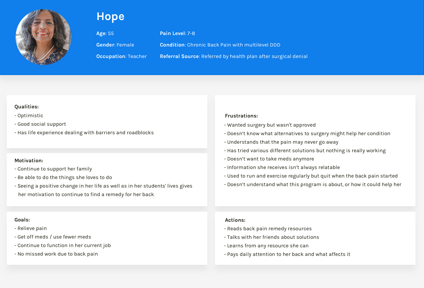
Persona Definition
This persona was developed based on insights gathered from user research, including interviews with
individuals experiencing chronic pain to understand their daily struggles, motivations, and emotional
responses.
Surveys were used to capture a broader range of experiences regarding treatment attempts, frustrations, and
support systems.
By synthesizing these insights, the persona of Hope was designed to represent a realistic composite of users
facing similar health challenges, helping to inform better solutions tailored to their needs.
3 Ideation & Design
During this phase, we focused on creating solutions that address Hope’s challenges while aligning with
business goals. The goal was to design clear, engaging, and accessible alternatives to surgery that reduce
confusion and help her manage pain with less reliance on medication. By prototyping and testing with real
users, we refined the designs to ensure they were practical, scalable, and effective in improving user
engagement and program adoption.
Objectives:
- Generate user-centered solutions that directly address Hope’s pain points and motivations.
- Design engaging content that focuses on addressing back-pain.
- Ensure solutions align with business goals while being realistic and scalable.
- Prototype initial concepts and test with real users for validation and refinement.
- Empower users to manage their pain with minimal dependence on medication.
-
Build trust and credibility by incorporating evidence-based strategies and offering guidance from a coach.
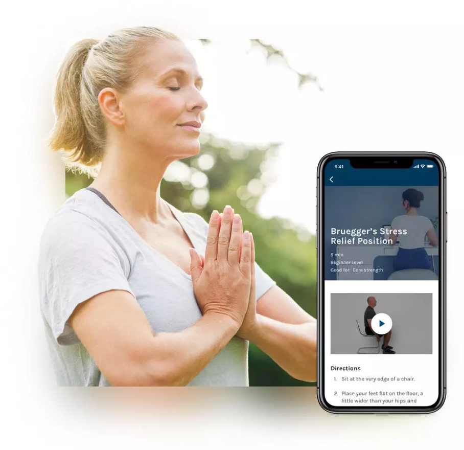
Sketch Ideation: Designing a User-Friendly Path to Back Pain Recovery
For each scenario, we held collaborative workshops to generate and refine ideas. A key focus was creating an
easy-to-navigate landing page with a personalized action plan. Our main goal was to give users the knowledge
they need to manage their back pain and access courses tailored to their specific needs.
To achieve this, we designed the following features:
- Pain Level Assessment – A guided tool to help users determine their back pain level.
-
Personalized Courses – Courses dynamically tailored to each user’s pain level and
condition.
-
Coach-Guided & Automated Course Creation – Coaches initially design courses based on
assessments, with future automation for scalability.
-
Activity Tracker on Landing Page – A progress tracker outlining tasks and courses to guide
users through recovery.
This approach ensures users receive structured, personalized support, empowering them to make informed
decisions and potentially avoid surgery.
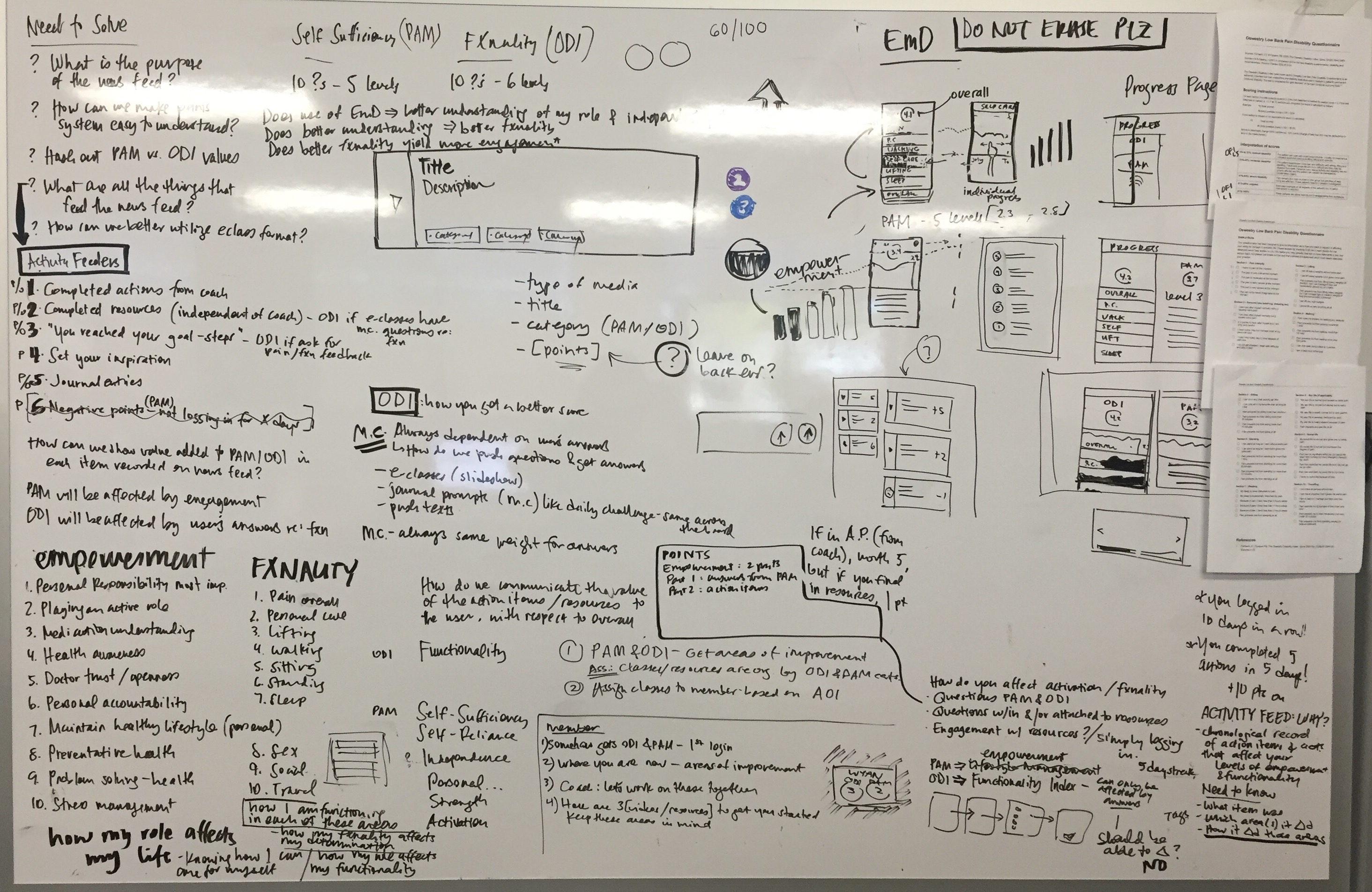
Designing a Dynamic Pain Assessment for User Progress Tracking
To effectively evaluate and categorize patients based on their back pain levels, we designed an interactive
pain assessment using the Oswestry Disability Index (ODI). This tool measures functional
disability through a structured questionnaire, enabling us to track user progress, personalize
recommendations, and guide them through their recovery journey. Our focus is not just on assessing pain but on
helping users actively improve and advance through their treatment plan.
Step 1: Onboarding & Initial Assessment
- Users complete a baseline survey upon signing up.
- Results provide a personalized starting point in their treatment program.
Step 2: Progress Tracking & Adaptive Feedback
- Users retake the assessment at regular intervals (weekly or after course milestones).
- A progress dashboard visually displays changes in pain levels and mobility.
- If improvement stalls, the system suggests adjustments to their care plan.
Step 3: Personalized Action Plan Based on Score
- Targeted Exercises to improve mobility and reduce pain.
- Educational Content on posture, pain management, and ergonomics.
- Professional Consultation Alerts if scores indicate worsening conditions.
Enhancing the Experience: Key Design Considerations
- Intuitive Visuals – Graphs, progress bars, and interactive reports.
- Conversational & Engaging UI – Step-by-step flow instead of a static form.
- Smart Adaptation – Dynamic questions based on responses.
- Motivational Feedback – Celebratory messages when users show improvement.
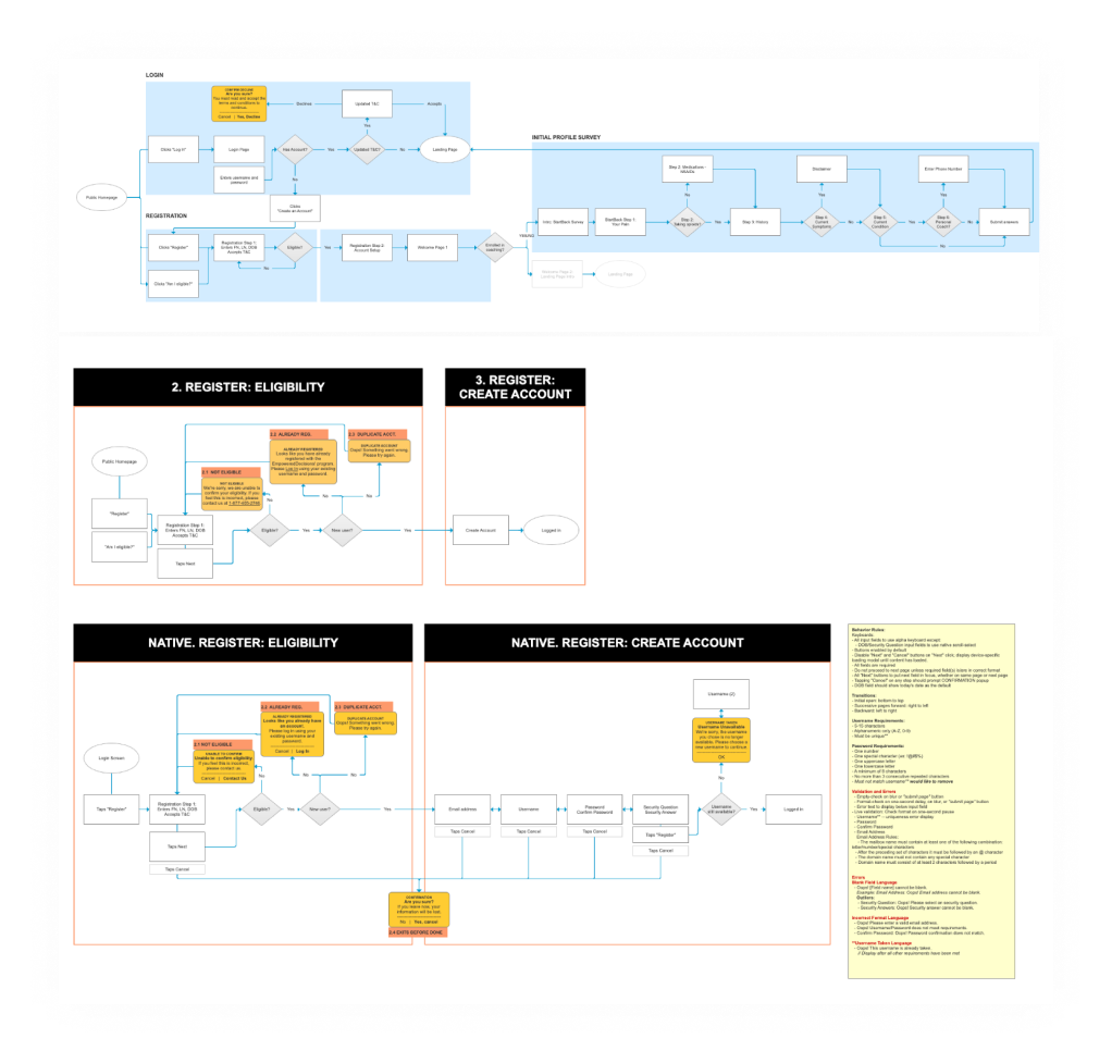
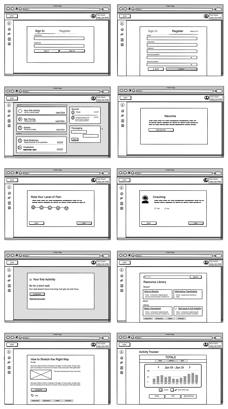
4 Wireframing & Prototyping
Objectives:
- Translate research insights into structured design concepts.
- Develop low-fidelity wireframes to map out user flows and interface structure.
- Create interactive prototypes to test key workflows and identify usability challenges.
- Iterate based on user feedback to refine functionality, navigation, and overall user experience.
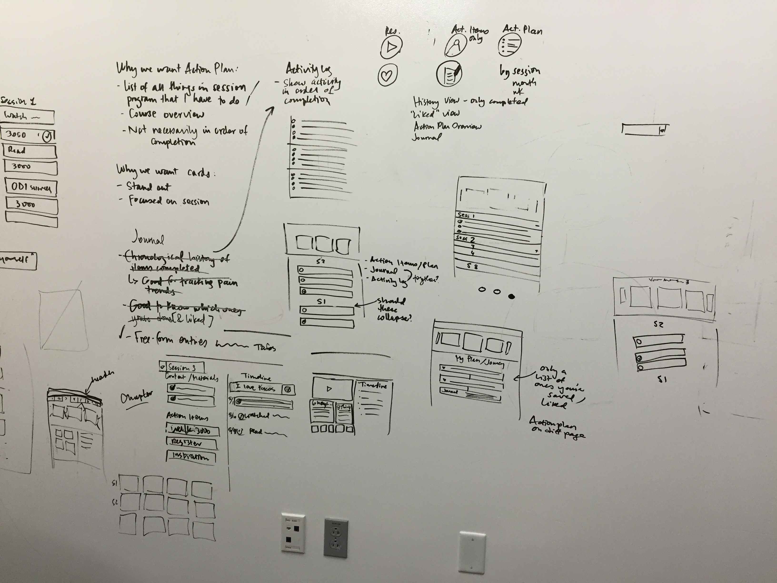
Wireframe Process
-
Brainstorm ideas through sketches, either collaboratively in a team brainstorming session or individually.
Present wireframes to the team.
- Gather team feedback and refine wireframes until the concept is solid.
-
Conduct user testing, gather feedback, and implement necessary updates. Re-test, and once we receive
positive feedback, proceed to high-fidelity designs.
- Implement updates based on user feedback.
- Re-test, and once we receive positive feedback, proceed to high-fidelity designs.
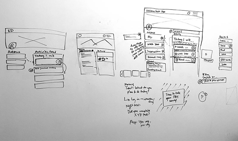
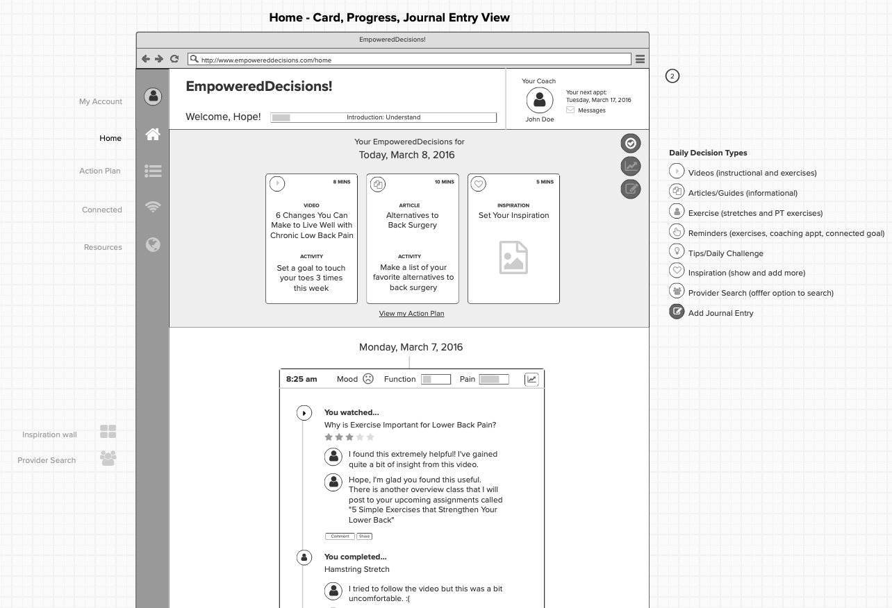
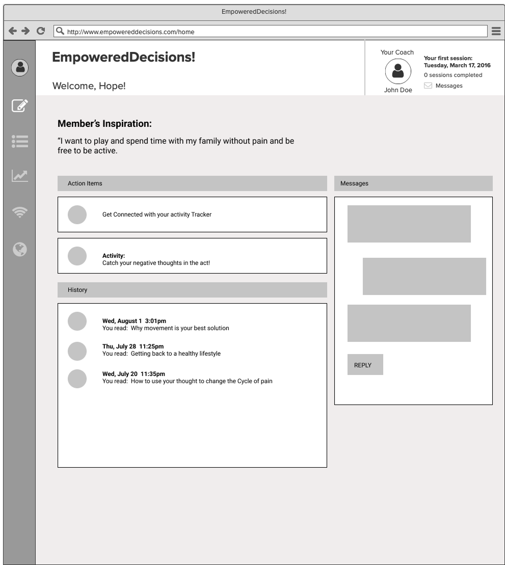
We continuously iterated on wireframes to refine the user experience. For example, I designed the initial
wireframes for the dashboard and action plan, which initially included a journal feature. This feature
allowed users to record motivational quotes and daily reflections, such as their daily mood. However,
usability testing revealed that users found the distinction between the journal and action items unclear and
showed little interest in using the journal.
These insights were invaluable, leading us to remove the journal and streamline the dashboard for a clearer,
more user-friendly experience.
At every stage, we created wireframes, conducted usability testing, and iterated based on feedback to refine
our approach. Initially, the dashboard included a journal feature where users could log motivational quotes
and daily reflections. However, as seen in the revised wireframes, usability testing revealed that users found
the distinction between journaling and action items unclear, leading to disengagement with the feature. Based
on these insights, we streamlined the dashboard to focus on actionable steps and user progress, improving
clarity and engagement. This iterative process ensured our design aligned with user needs, ultimately leading
to a more intuitive and supportive experience. Once we had a validated vision, we transitioned to
high-fidelity mockups, refining the visual design, branding, and details for a polished final product.
Journey Mapping
Rather than being created in the early pre-ideation phase, the journey map was developed post-ideation to
refine and validate our design decisions. By visualizing the user's experience—from discovery through
interaction and reflection—I was able to identify critical pain points, such as difficulties in signing up,
uncertainty about progress, and challenges with the activity tracker.
Using these insights, I worked to pinpoint opportunities for improvement, such as simplifying onboarding,
providing clearer guidance on tracking progress, and enhancing engagement with coaches. Aligning these
findings with cross-functional teams allowed us to iterate on our designs, creating a more intuitive and
empathetic experience that ensured users felt supported and motivated throughout their back-pain management
journey.
5 Test and Iterate
Objectives:
- Validate usability and functionality — conduct usability feedback
- Identify and prioritize areas for improvement
- Test and validate iterations
Refinement & Finalization
After multiple iterations, presentations to stakeholders, feedback from the development team regarding
feasibility, business needs, and user testing, as well as usability tests and prototype evaluations, we
arrived at high-fidelity mockups. At this stage, we have finalized the visual style and refined the look and
feel of the website, ensuring it aligns with the marketing team's branding.
Development Handoff and Development Phase
After completing the high-fidelity mockups, we moved into the development handoff phase. This process involved
close collaboration between designers, front-end developers, and back-end developers to ensure a seamless
transition from design to implementation. The design assets, including UI components and specifications, were
shared with the development team to ensure accurate execution.
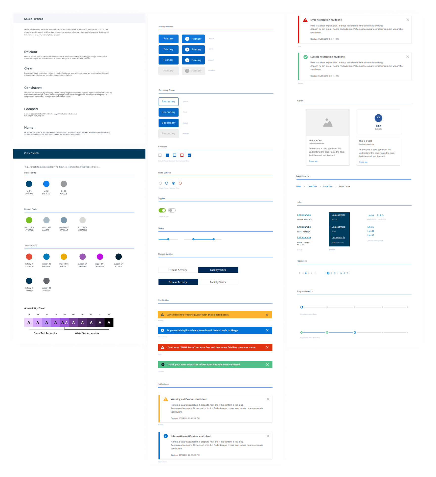
UI Elements and Styleguide
Creating the style guide and defining UI elements was a collaborative effort involving the marketing team,
front-end developers, and back-end developers. Working alongside a dedicated team of designers, we ensured
that the styleguide was comprehensive and that all new components could easily be integrated into the design
system. This collaborative approach allowed us to maintain consistency and flexibility across the website,
while ensuring that the design system could evolve with future updates.
Design System & Component Styling
Empowered Decisions was part of a broader ecosystem of wellness sites that shared common UI components while
maintaining distinct branding. To achieve this balance, we ensured that all components adhered to a cohesive
design system while allowing for site-specific styling to reflect each brand’s unique identity. This required
close collaboration between designers, front-end developers, and the marketing team to establish a flexible
yet structured approach to component styling.
By defining a comprehensive style guide and UI component library, we created a scalable system that ensured
consistency across multiple experiences while accommodating variations in typography, color, and visual
aesthetics. Our iterative approach allowed the design system to evolve, integrating new components seamlessly
while maintaining usability and accessibility standards. Through this effort, we streamlined development,
improved efficiency, and ensured that all wellness sites provided a unified yet brand-specific user
experience.
Web Accessibility and W3C Compliance
When designing components, I prioritized web accessibility to ensure our website met inclusivity and
compliance standards. I followed WCAG guidelines by ensuring proper color contrast, using semantic HTML,
defining appropriate ARIA roles, and implementing responsive design. I also incorporated keyboard navigation
support, added alt text for images, and provided captions for multimedia content. These efforts helped create
an accessible digital experience for all users, including those with disabilities.
Key Takeaways
The development of the Empowered Decisions platform was not just about creating a digital tool—it was about
transforming lives. Throughout this journey, we saw firsthand the struggles individuals face
in managing chronic back pain and the immense impact that accessible, non-surgical solutions could have. After
the launch, the stories we received from users were profoundly moving: individuals who had long felt powerless
over their pain were now regaining control, mobility, and confidence in their daily lives.
The most rewarding aspect of this project was hearing from users who regained the ability to play with their
children, return to work without constant discomfort, or simply wake up in the morning without pain dictating
their day. Empowered Decisions was more than just a product—it became a bridge to a better quality of life for
thousands of people. As we look toward the future, we aim to build on this success by integrating AI-driven
personalized coaching and wearable health tracking, ensuring even greater engagement and long-term health
outcomes.
This project gave me the opportunity to run an end-to-end design process, including user research, stakeholder
workshops, brainstorming, ideation, wireframing, and final visual design. Through this experience, I gained
valuable insights into the importance of research and gathering feedback early in the process to create a more
user-centered and effective design.
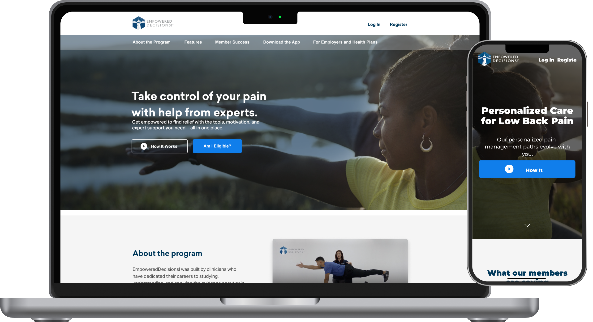
Final Prototype