The Need
Krispy Kreme Doughnuts acknowledged the necessity of introducing an interactive, personalized, and user-friendly loyalty program to address two crucial challenges. Firstly, the company experienced limited repeat business, primarily from customers who only made purchases on special occasions. Secondly, customer engagement with the brand needed improvement. To tackle these issues, Krispy Kreme aimed to implement a loyalty program that not only retained existing customers cost-effectively but also created a distinct brand identity and elevated the overall customer experience.
The Solution
How might we enhance user engagement with the Krispy Kreme Loyalty program, encouraging them to actively participate and take advantage of earning and redeeming points?
Following a thorough competitive analysis of popular reward programs, our objective for Krispy Kreme was clear: we aimed to create a uniquely appealing experience for users, ensuring simplicity and seamless redemption of rewards. To achieve this, we prioritized an effortless and quick sign-up process, requiring minimal personal information initially and gradually seeking more details over time. Our goal was to make Krispy Kreme's reward program distinct, user-friendly, and enjoyable for all customers.
Project Role
Team Structure
Tools
Creative Discovery
Understand the User and their Needs
During our creative discovery we want to learn what we are building, what the business needs are, who the user persona is, the user needs, motivations and frustrations. Understanging the primary persona helps us to empatize with the user and always have them in mind when we design and brainstorm.
Definition Statement
“An intuitive tool to reward generous people who spread joy through sharing Krispy Kreme.”
The definition statement is driven primarily by valuable client feedback. It guides the purpose of our rewards program. It serves as a constant reminder of our primary objective, helping us make informed decisions and ensuring we stay focused on building a meaningful experience. By adhering to this North Star, we can avoid the addition of unnecessary features and maintain the core essence of our rewards program.
KPIs and measuring success
Understand the important metrics that can drive the major design decisions, what KPIs we need to match the business goals and the user's goals.
Information Architecture
During the discovery process we also want to create an information architecture that reflects the current AI and learn ways to improve that architecture and how the user will achieve their primary tasks.
Journey Map
Creating a journey map will help us learn the current user pain points and where are opportunities for improvements.
Persona
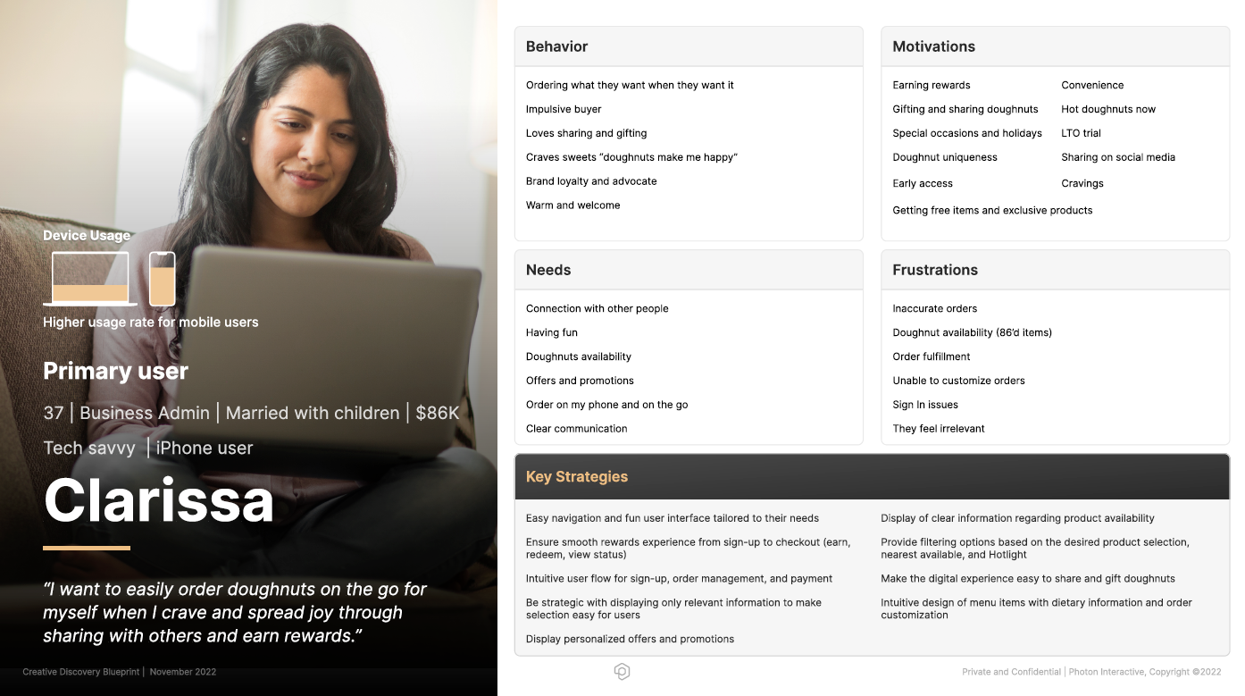
The primary persona Clarissa is a busy, married woman with children. Her needs are able to order doughnuts on the go for her family and coworkers or special events. Her motivations are earning rewards and conveniently redeems them on the app or at the shop.

User Pain Points and Opportunities for Improvement
Some of the pain points we found were through conducting
Make Sign-up Easy
- Make the sign-up as easy as possible, allowing user to sign-up fast and easy then ask for more information later.
- Allow other methods to sign-up that don't require entering information like Facebook, Google, etc.
Improve Menu
- Menu needs to be classified into groups for the user to easily pick from categories instead of everything at once.
- Menu needs to be readily available in the homepage and user should be able to order directly from the menu.
Payment Methods
- Provide easy payment methods like apple pay and allow user to auto-load payment into card. Entering credict card information is time consuming and providing one-click methods will help alleviate this painful task.
Journey Map
We created current state and future state journey maps, helping us to see the user pain-points, opportunities for improvements and where we can hightlight the user's journey through the experience and understand their struggles.
Wireframes
The wireframe phase allowed us to brainstorm ideas for the hero flow


