See your doctor virtually through video
Due to COVID-19, Sharp had an immediate need for a virtual doctor interface to promote virtual care and help users see their doctors through video.
The Challenge
How might we help users see a doctor virtually and feel safe and confident about their visit?
The initial design was an MVP version without development effort and with the constraints of an outdated CMS. After the MVP was launched we had time to improve the user experience.
Project Role
Tools
Customer Insights
Through initial user interviews, we learned that users were willing to see a doctor virtually but they had questions about how virtual urgent care works, since most of them had not seen a doctor virtually previously they had questions about the cost, what they could see a doctor for, the length of the visit, and how they would connect to the doctor. The research was helpful in driving some of our initial design decisions and to answer some of those questions.
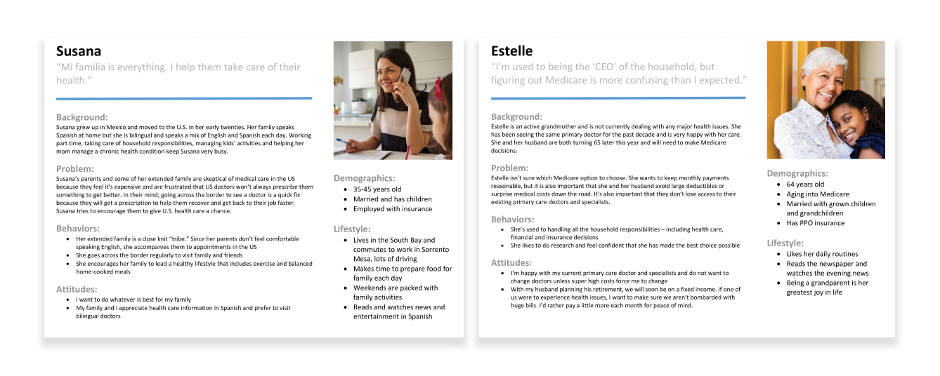
Primary Personas
Most of our user interviews were based on our two primary personas, Susana, a 35-45-year-old married woman with kids who manages her family's health. Estelle, Sharp's second most popular persona, a senior, 64-year-old woman who is aging into Medicare.
Understanding the user flow
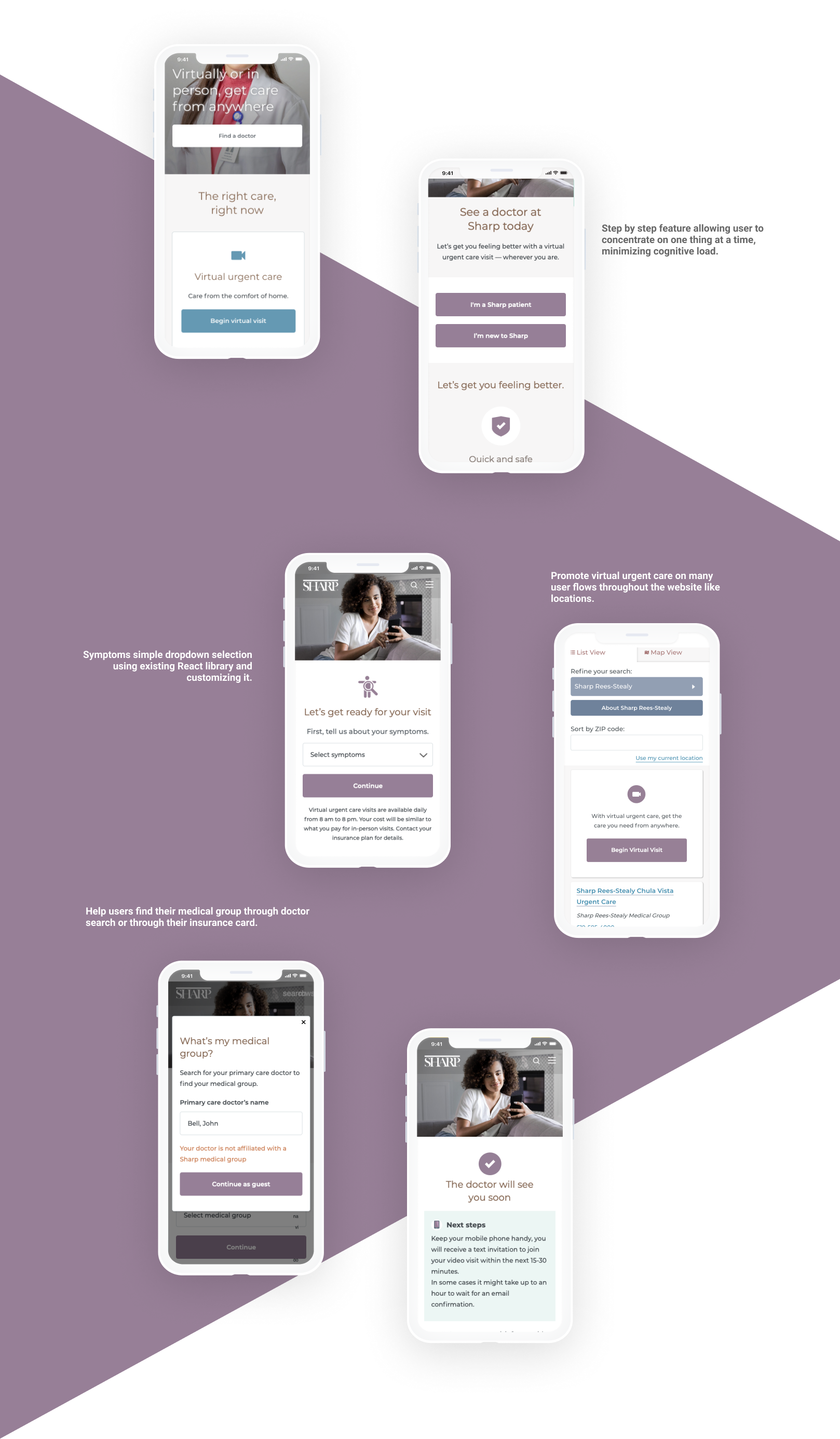
It is crucial to understand the path a user will take through a user flow. Due to changing business requirements, the user flow changed on multiple occasions but we were able to understand how to target the user through different touchpoints. One was on the landing page, while the user is searching for a doctor and on the locations page. The effort was part of the Get Care campaign, getting users the care they need, and when they need it.
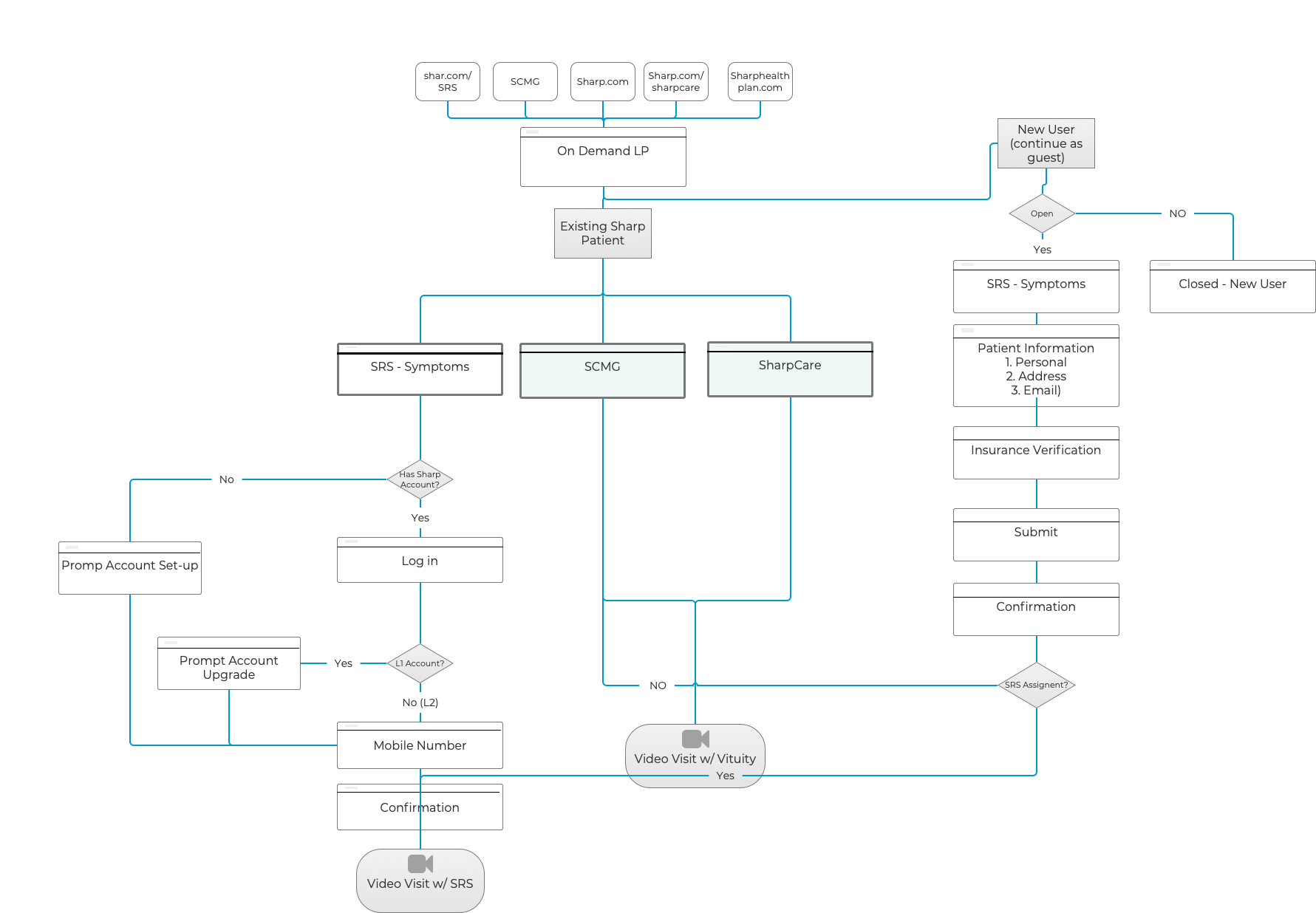
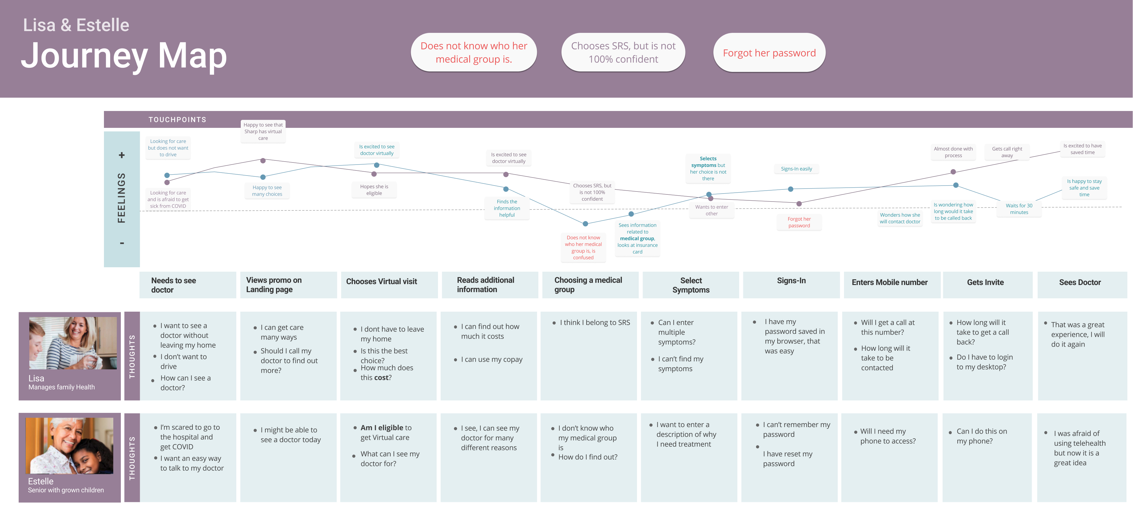
Journey Map
The Journey map helped us see the user's pain points and address those pain points on our design decisions.
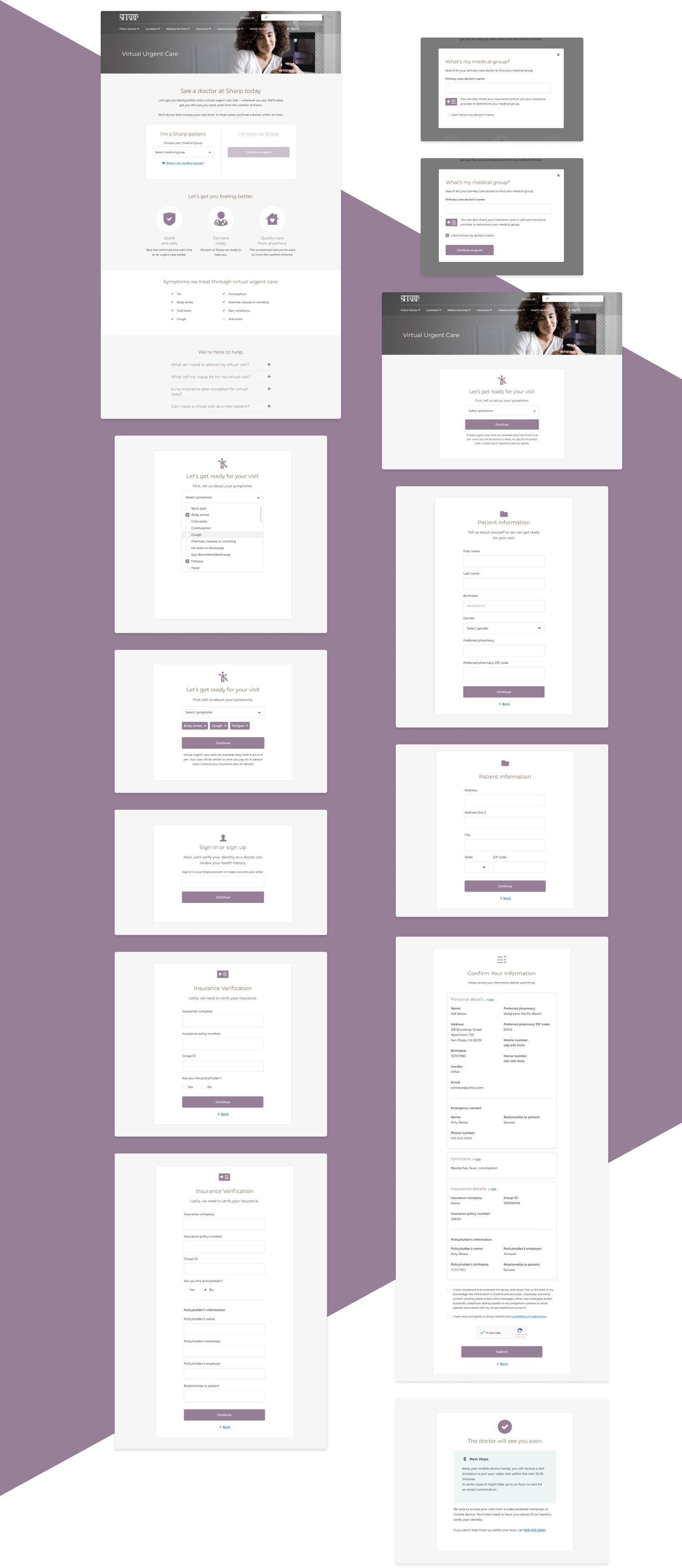
After interviewing users, we learned that most of them did not know their medical group. For Sharp this was a big issue, we had to filter out users by medical group because different medical groups had different telehealth vendors. This was a business problem that we wanted to address and allow the user to get care without confusion.
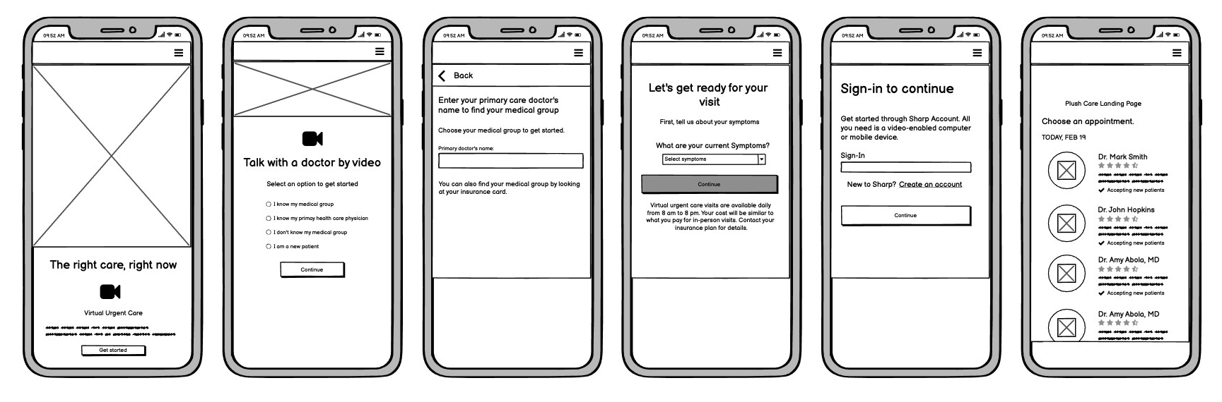
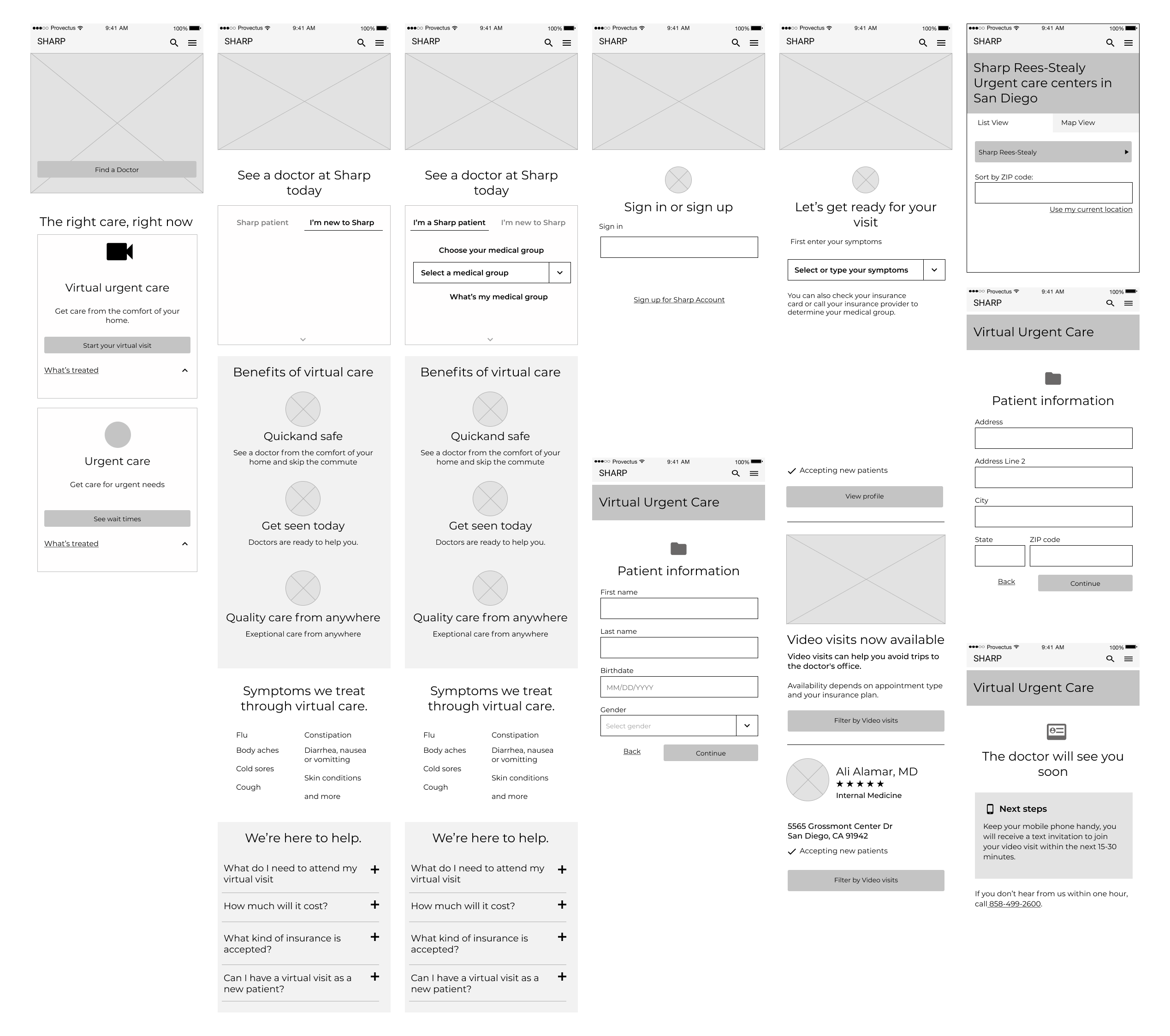
Initial Wireframes
The initial phase was to create an MVP version with very little time and no development effort, using an outdated and constrained CMS. While working with content writers the initial wireframes had a lot of content but due to the tight deadline, we decided to improve the experience after the MVP. We cut down some of the content but the interface needed a redesign with some development effort.
Initial User Testing
Initial user testing showed that users struggled with choosing a medical group. Almost all were confused or not all sure which medical group they belonged to. We knew this was a big problem because we had to take the users to the correct medical group and the correct third party vendor. Our goal was to guide the users in finding their medical group.
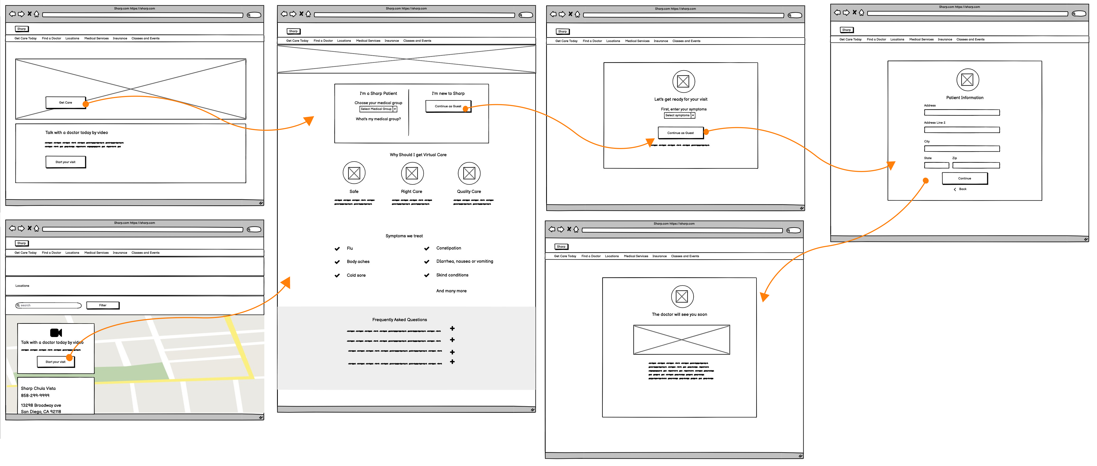
Back to the drawing board
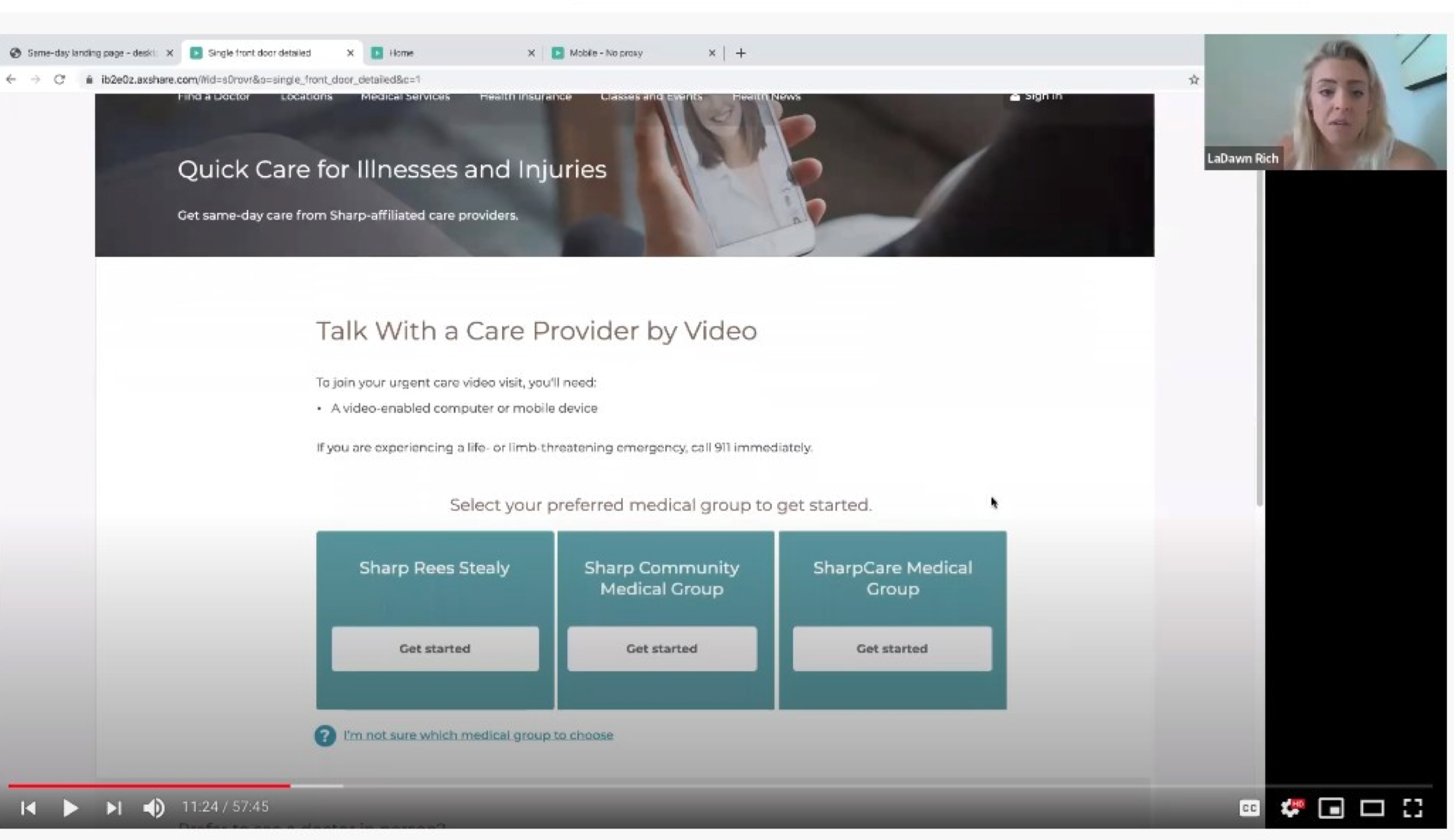
It was time to iterate and improve the experience from user testing, research, and feedback. This time we had development effort and were not so constricted to an outdated CMS. We knew we could not get rid of medical groups so we had to find a better way for users to find out what medical group they belonged to. From user testing, we also knew that users had a lot of questions about telehealth. We tried addressing those questions and providing a landing page with snippets of information, a drastic change from the content-driven design.
Medical groups
Our goal with the medical groups was to make it easier for the user to pick or learn about their medical group. We designed our experience to try to guide the user and allow them to continue if they still did not know who their medical group was.
The interface was designed with progressive disclosure in mind, only giving the user a few options at a time. The fewer options or choices the user had to think about the less cognitive load on the user. The user would make an initial choice if they were an existing patient or a new patient. Step-by-step they were guided to the right flow, simplifying their experience.
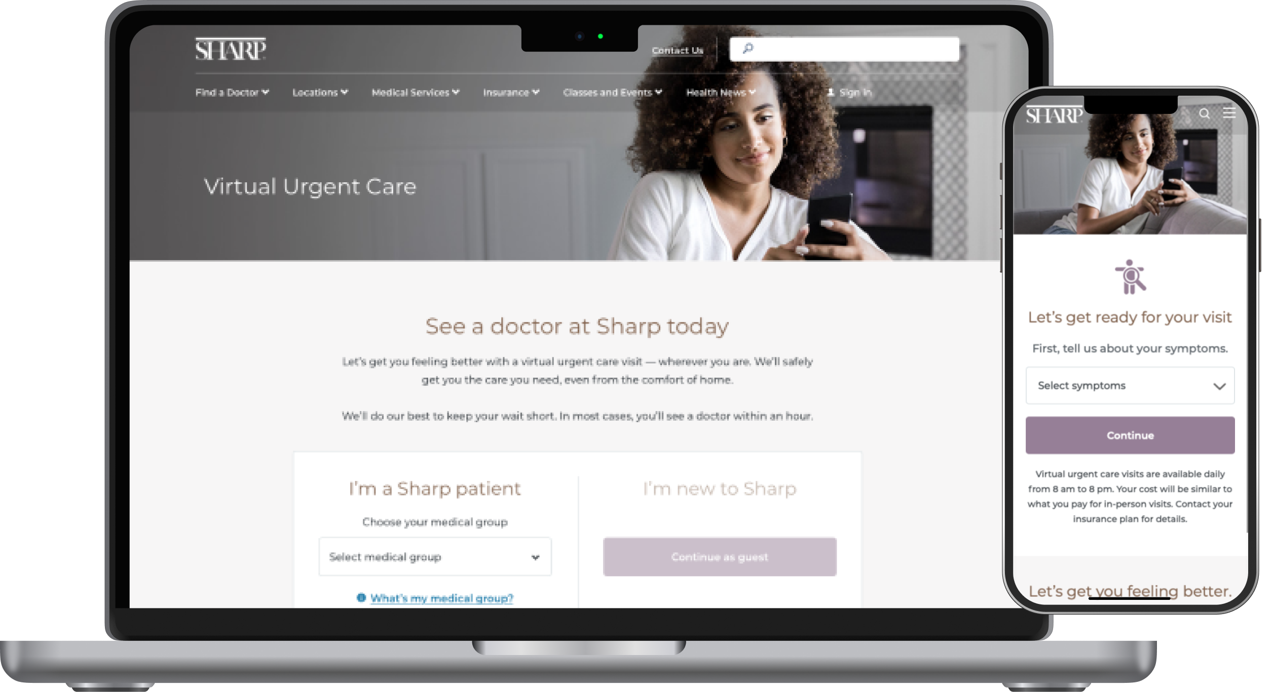
We also cut down the content significantly. Instead of a content-heavy design, we decided to create sections that showed snapshots of virtual video. This was tough because Sharp content writers were used to writing long paragraphs of text. Little by little, we trimmed down the content to simplify the experience. In great user experience, you don't have to explain or give instructions, the user experience guides you.
Our persona scenario was Becky, our primary persona, a working mom, using her phone while she carries her child and wants to be able to multi-task. There are a lot of distractions and she wants to set-up an appointment fast because her other child is crying in the background. She has no time to read text or instructions, she wants to scan the information and get the information she needs to make a decision. She looks at the information and her questions are answered through the FAQ and the bullets, the different sections provide her assurance of what virtual care is about and she is ready to get started.
User testing - Phase 2
We tested our prototypes and users were really happy with the experience. Some of the feedback given by the users were "this is amazing", "I love this", "this is so easy". We knew we had done something right and we were ready to build.
Mockups and next steps
Time to look at our UI Kit and create the high fidelity mockups. Sharp had an existing UI kit but it was outdated and the website used inconsistent styles throughout different experiences. We were also working with a third party to help us establish a styleguide.